Paint Splodge Text

by Steve Tolley

This is just a quick text effect tutorial, This will show you how to simply create a paint splodge looking text using blending options and the pen tool it will take only around 5 minutes to complete (Depends how much detail you add).

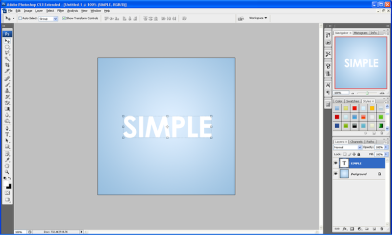
What We Are Going To Achieve

Step 1 - New Document

First of all open up a new document around the size 500 x 500 and fill with a radial gradient from #102f40 to black (#000000) so you are left with something like below:

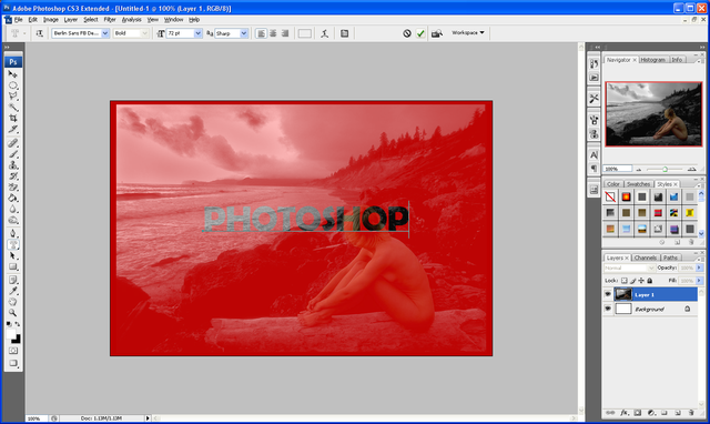
Step 2 - Add The Text

For this tutorial I am just doing a single letter so I can show you the techniques, but this can be applied to any letter of the alphabet, therefore I am going to use the letter “P” so simply pick the colour that you want the paint to be and write your text in that colour:

Step 3 - Add The Splodge

Now you can draw the paint splodge simply pick up the pen tool and draw what resembles a splodge of paint, not every splodge will look the same so just experiment and play around until you get something you are happy with (make sure it is filled with the same colour as the letter), when done you should have something similar to below (can be used as a reference)

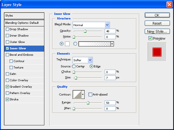
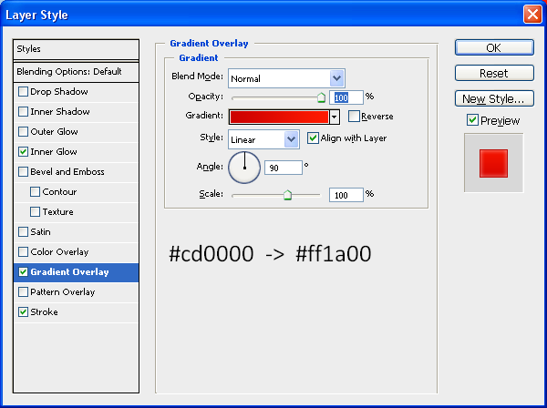
Step 4 - Add Blending Options To Both

We shall add blending options to the text first so double click the layer in the layers tab which will bring up the blending options menu, when this is open use the settings as shown below:

Bevel And Emboss:

With this applied right click on the Text layer and choose “Copy Layer Style” and then right click on the Splodge layer and choose “Paste Layer Style” as shown below:

This will simply copy and paste the blending options to the splodge shape when this is done you will have some text and a splodge that resembles that shown below:

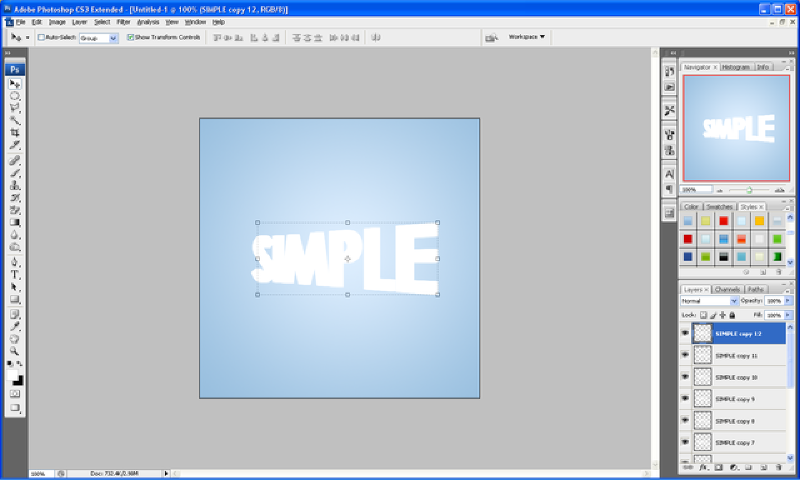
Step 5 - Positioning And Adding Details

Now you need to position the splodge so that it looks like it is part of the text so just simply play around with moving it around until you get something you are happy with:

With it now in position you are nearly finished all you need to do now is add some detail, like some drips of paint and extra splodges on the floor, this is all simple to do but just play around with the pen tool creating cool shapes and then don’t forget to keep pasting the blending options onto each new splodge you do, and have fun experimenting, when you are done you will have something that resembles my finished product:

And as always if you have any problems with this tutorial then don’t hesitate to leave me a comment or email me at: stevie489@googlemail.com and I will help you as much as I can…

15 Of The All Time Best Text Effects

by Steve Tolley

This article is rammed full of the 15 BEST text effects around at the minute, it has taken me a while to filter out the best text effects from the not so great ones, even though there are alot of fantastic ones out there they can’t quite compete with the quality of these ones, and yes the majority are from sites such as PSDTuts and Tutorial9 as these do produce tutorials of the highest quality so here we go…

1. Super Natural

A fantastic text effect tutorial to start us off with, this tutorial takes advantage of the Wave Distortion filter in Photoshop to give an eerie supernatural text effect.

2. Flaming Meteor Effect

This tutorial takes text effects one step further and makes it look as though your text is truly falling from the sky in a ball of flames, this tutorial was written by Fabio who also owns Abduzeedo which I must say is a fantastic website for similar effects.

3. Transparent Glass

This tutorial shows us how to simply but effectively create a transparent glass effect for our text which finishes up to be a very realistic outcome, what else do you expect from PSDTuts?

4. Smooth Glass

This tutorial is similar to the previous one in the list but then again the end results are very different, but another great tutorial blending together rather simple techniques to bring such a professional and realistic outcome.

5. Using Light And Shade To Bring Text To Life

This tutorial is not as such a text effect but how to bring your text to life by using light and shade and again the outcome is amazingly realistic.

6. Light Burst

This tutorial has been around for quite a while now and has been very popular but is still classed in my eyes as one of the best text effects as the simplicity coupled with the great outcome makes it stand out from the rest.

7. Earth

A fantastic text effect again from PSDTuts this shows us how we can use actual images placed on top of the text to create a fantastic end result, this is also one of my favourite tutorials because of it’s realism.

8. Dramatic Fire

This fire effect makes this stand out from the rest simply for the fact of  how well it is implemented into the text and how an image of fire can be used to make a truly realistic outcome compared to computer generated fire.

9. Snow N’ Ice

Another favourite of mine because of the cartoony effect this gives, I can see this being used in a poster for a wintery cartoon/movie for instance Ice Age and a result that can be gained so simply.

10. 3D Typographic

An effect which has also been around for a while but again still one of the best out there, this combines the use of a 3D program called Xara 3D, this creates letters with realistic lighting and shadow, these letters are  then imported into Photoshop to make them look as good as they do.

11. Ghost

A not so well known tutorial but one that I think results in a fantastically creepy ghost effect which can be implemented into many scary designs/images

12. MoonShine

A relatively new text effect in the tutorial world but one that stands out from the rest simply due to the fact of the professional looking outcome and simple techniques that can be learned from this tutorial.

13. Colourful Glowing Text

Again another new text effect but one that is explained so well, from Tutorial9 which is a fantastic website full of inspiring tutorials and great effects.

14. Grunge

A great effect in this tutorial showing how to create a fantastic grunge style text effect using textures and layer styles from a great website that looks to be going to same way PSDTuts has gone with it’s popularity.

15. Layered Glowing Effect

And to finish another fantastic tutorial from PSDTuts this effect uses multiple layers to create a truly spectacular glowing effect which I can see myself using in future projects.

Summary

To summarise as you can see all of these tutorials are of the highest quality and A LOT can be learned from them which can then be used in your own projects/designs, I would like to say a big thanks to all of those people who have taken their time to create such fantastic inspiring tutorials and hope that my tutorials can one day match the quality and standard of the ones shown in this article.

Bringing Backgrounds To Life Part 1

by Steve Tolley

OK my first tutorial for quite a while now, after successfully securing a place in university I am ready to start posting again whilst looking for a decent host for my new website design (any help appreciated) to get me back into the swing of things I am going to do a relatively easy tutorial to start with, but one I think is very useful when making any type of image that looks a bit plain and boring, the best way to make these sorts of images look better is to simply apply a texture over the top of your background or specific part of the document (e.g. Text) and it is much easier than you may think

Applying a Texture to a Background.

Step 1 - Make a Gradient

First of all below we have the plain and boring background which I made with neutral colours and a simple lighting effect (Filter > Render > Lighting Effects) in the middle of the canvas.

Step 2 - Drag And Drop Texture Onto Background

Next we simply open up the texture we want to use and drag and drop it on the background we are using (make sure the texture layer shows “Layer 0” or something similar and not “Background” if this is the case double click the layer and then click OK)

Step 3 - Desaturate The Texture

Next position the texture on the canvas so you get the desired effect and then press CTRL + SHIFT + U this combination will desaturate the selected layer / texture

Step 4 - Set Layer Style To Overlay

Now set the layer style to “Overlay” as shown below and adjust the opacity accordingly to get the effect (depth of detail) that you want.

Step 5 - Finished

And now the plain and boring background is brought to life by simply adding a texture which adds depth to the image.

This tutorial is the first part of a series that will explain how else you can bring your images/backgrounds to life, sign up to the RSS feed to receive updates when these tutorials are released,

The texture used in this tutorial is available HERE along with 3 other paper style textures,

If you have had any problems with this tutorial and would like some help then don’t hesitate to contact me either by leaving a comment below, or e-mailing me at: stevie489@googlemail.com

Text Masking An Image

by Steve Tolley

This tutorial shows you how to use the “Horizontal Type Mask Tool” to cut the text out of an image so that you are left with very unique text, this tutorial can be applied to any image to get a really nice effect.

Step 1: First of all you need to get any image that you want and open it up in Photoshop (I used this image for this tutorial)

Step 2: Now click and hold on the text tool until the options appear below, and choose “Horizontal Type Mask Tool”

Step 3: Now just write the text you want as you normally would so it looks like below, when done press the tick button on the top toolbar and you will get a text outline selection:

Step 4: Now simply press CTRL + Shift + I and press delete this will delete everything outside of the written Type mask and just leave you with the finished result as shown below:

This can be used on any image and the result can be implemented into any future designs or projects,

If you have had any problems with this tutorial and would like some help then don’t hesitate to contact me either by leaving a comment below or e-mailing me at: stevie489@googlemail.com

How To Make 3D Perspective Text

by Steve Tolley

This tutorial shows you some basic techniques using different blending options to get a 3D text that is in perspective, with a nice end result which really stands out.

Step 1: First of all create a new document whatever size you like (for this I have used size 500 x 500)

Step 2: Select the gradient tool from the left hand toolbar and set the gradient to the colours and settings as shown below (or you can use your own colours, whichever suits you more)

Step 3: With the gradient set choose the text tool and write out the text you want, for best results use a thicker text (I used Century Gothic, set to bold) and then resize to whatever size you need.

Step 4: Right click on the text layer and choose Rasterize Layer which will convert the text to pixels, now click on one of the little boxes that surround the text like below:

Step 5: Now right click on the text and it should bring up a menu like below, from this choose perspective:

Step 6: Click and hold on the bottom right corner and drag downwards as shown below:

Step 7: When done click the tick button on the top toolbar to apply changes and now simply press CTRL + J (this will duplicate the layer) and press the right arrow once, repeat this as many times as you like or until it looks something like below (I did it 12 times), so this is the order…
CTRL + J, ->,
CTRL + J, ->,
etc…

Result:

Step 8: Now get the first layer of text again and drag to the top of all the other layers so it is the top layer, this is where we add some colour to the text, double click on the original layer and this will bring up the “Blending Options Menu” when this appears use the settings as shown below: (alternatively you can use your own colours)

Inner Glow:

Gradient Overlay:

Stroke:

Step 9: Now select all of the other duplicated layers (not the original or the background) and right click and choose “Merge Layers” this will put all of the chosen layers into just one layer, now double click on the merged layer which will again bring up the “Blending Options” now use the settings as below or again you can use your own colours:

Gradient Overlay:

Stroke:

Step 10: To finish this text off simply create a new layer above all of the other layers and choose the “elliptical marquee tool” and make a selection like the one below:

Step 11: Now fill this selection in with white, and now hold CTRL and click in the box next to the layer name on the original layer (this should select the outline of the text) now press CTRL + Shift + I, this will invert the selection and with the new layer still selected press delete this should delete the white that is not wanted and leave you with something similar to below:

Now set the new layer opacity to 35% using the bar on the top of the layers window which says “Opacity” and then you will have your finished text 3D text perspective:

Finished Result:

If you have had any problems with this tutorial and would like some help then don’t hesitate to contact me either by leaving a comment below or e-mailing me at: stevie489@googlemail.com