Creating A Grungy Banner

by Steve Tolley

This tutorial will show you how to create a grungy style banner that can be used on posters or on websites, it is a very simple process and therefore quite a short tutorial but offers techniques which can be used on any project,

What We Are Going To Achieve

Grungy Banner Done

Step 1 - Create New Document

First of all as always you need to create a new document for this tutorial I have used the sizes 500 x 500 but as normal you can use whatever size is suitable for you, once you have this then fill the document with the colour #FFFDE6

Step 2 - Draw Some Rounded Rectangles

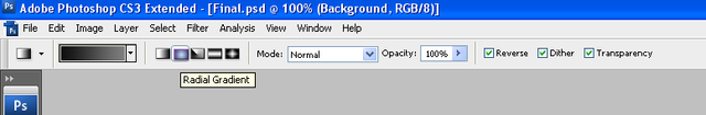
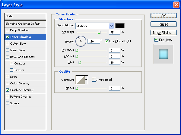
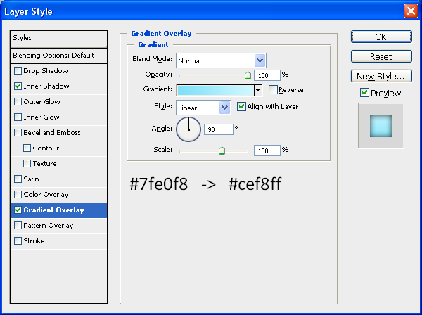
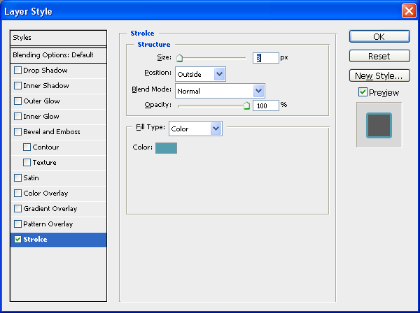
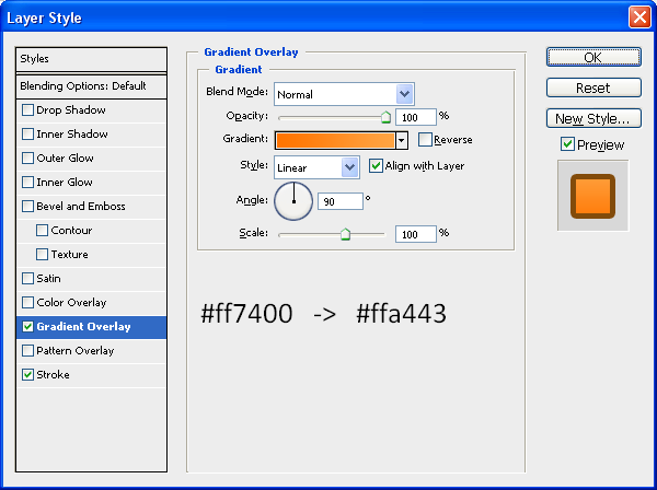
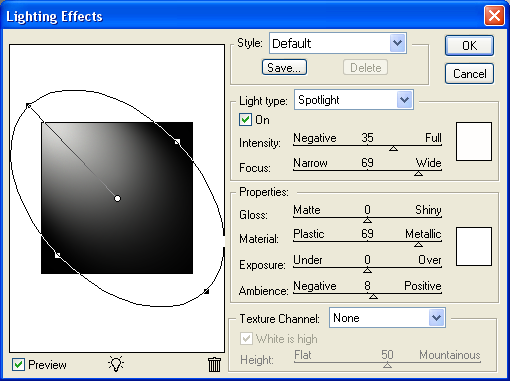
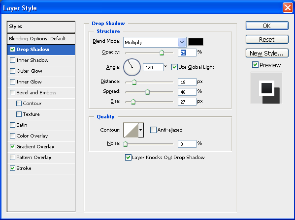
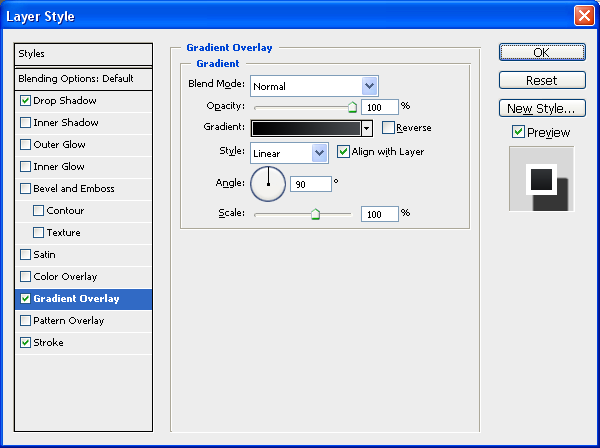
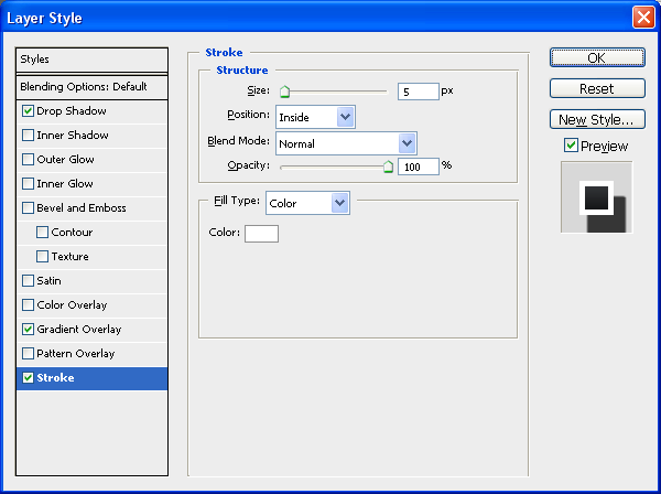
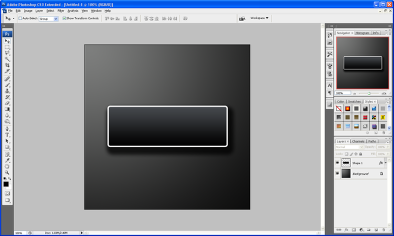
This step is simply to draw 2 rounded rectangles using the rounded rectangle tool (shown below) so make sure that your foreground colour is set to #FFFDE6 and draw a rounded rectangle with a radius of 5px, when this is done double click the new shape in the layers tab which will bring up the blending options menu, with this open use the below settings:

Rectangle Tool

Stroke:

Rectangle Stroke

With these settings applied you should have something similar to below:

First Rectangle Done

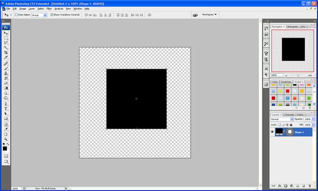
Now we need to draw our second rounded rectangle, this time make sure that the foreground colour is set to black (#000000) and draw a shape the same as below:

Second Rectangle Done

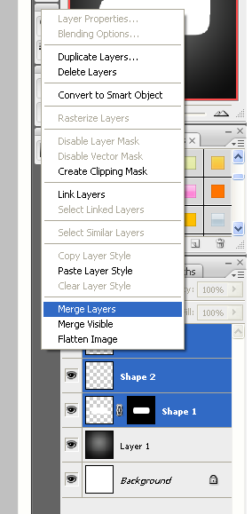
Now right click in the layers panel on the second shape and choose rasterize layer as shown below:

Rasterize Layer

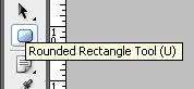
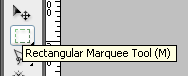
With this done select the Rectangular Marquee Tool (Shown Below) and make a selection the same as what I have done below:

Rectangular Marquee Tool

When you have the same selection simply press delete (Note: Make sure that you have the second shape layer selected otherwise it won’t do anything) when this is done you should have a shape with a flat bottom which then needs to be positioned on top of the other shape as shown below:

Now to finish off with these two shapes select both of the in the layers tab (CTRL + Click both of the layers) and then choose the Move Tool and rotate the two layers so that you have the outcome below:

Step 3 - Adding The Brushes

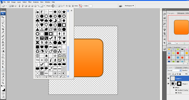
The first brush set we are going to use can be found on Brusheezy but to save you time finding it there is a link to it HERE, once you have downloaded the brushes load them into Photoshop and use the brush shown below:

With this brush selected create a New Layer (CTRL + Shift + N) and set black as your foreground colour and then press the ” [ ” key on your keyboard this will make the brush go smaller, I made mine go to 200px and the applied it to the top right hand corner of the rectangles we created earlier:

Now you have the basic principle you can play around with the different brushes in the pack and apply them all over the shape, but make sure to create a new layer for each separate brush as this allows you to change them later if needed, when I had finished playing around I had something like below:

Now if you wanted you could change the foreground colour of the brushes and apply some more around the rectangles to make it look more warn like below:

Next we need to add the second set of brushes which can be located and downloaded HERE and then we can start playing around with these brushes, there aren’t a lot in this set so just choose the brushes that you like the best and apply them on your banner, you can use the below image as reference (Note: Make sure the foreground colour is set to black #000000)

As you can see it is just a case of experimenting where you want the brushes to go and where looks good, when you have something you are happy with then we can move onto the final step.

Step 4 - Adding The Text

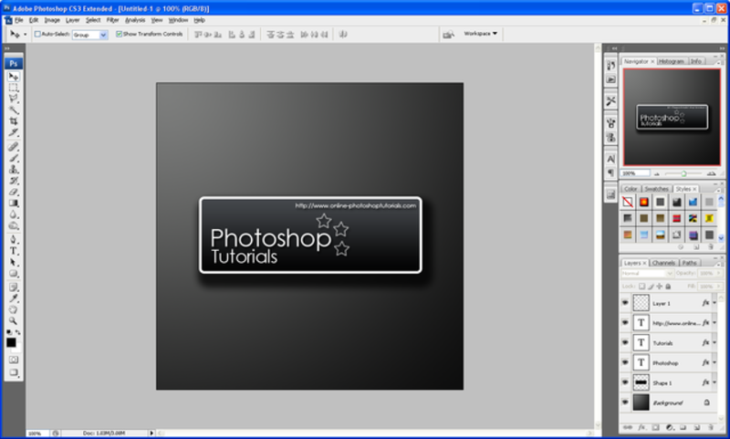
Now it is just a case of adding some text to the banner I simply added the name of my website like below (Note: I used the Font TW CEN MT Condensed Extra Bold) when the text has been been added simply rotate as before and place inside the of the banner:

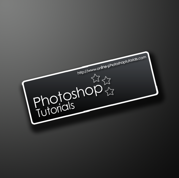
Now to finish off you can some more of the splatter brushes over the top of the text which would help make the text look worn and grungy like the rest of the image and when this is done you have the finished product like below, this could be used for posters or websites the list is endless:

And as always if you have any problems with this tutorial then don’t hesitate to leave me a comment or email me at: stevie489@googlemail.com and I will help you as much as I can…

Making A Modern Looking Navigation Button

by Steve Tolley

This tutorial will teach you some fundamental techniques when it comes to making cool looking buttons for a navigation bar easy to understand with plenty of detail and a nice looking outcome that can be used on any modern looking website.

Step 1: First of all open up a new document any size that you want (I used sizes 500 x 500)

Step 2: Now choose the gradient tool and set the gradient to radial gradient as shown below, and set the colours to: #000000, #49454d and drag from the middle outwards so that the lighter colour is in the middle.

Step 3: Now choose the rectangle tool and draw quite a large rectangle in the centre of the document, we now need to curve the edges, to do this simply follow this tutorial on “How To Round The Corners of A Shape Using Levels” after this you should be left with something like below:

Step 4: Now we need to draw a small rectangle and place it in the top right hand corner of the rectangle this will make that corner square again which gives the button a more modern cool look, when done press CTRL + J (Duplicate) with the small rectangle selected and move the duplicate layer to the bottom left hand corner to create the same effect so that you are left with something similar to below:

Step 5: Now right click on the separate layers that you have and choose “Rasterize Layer” this will convert the shapes to pixels, when done select all 3 of your rectangles and right click on one of them and choose “Merge Layers” this will merge them all into one layer:

Step 6: Next you need to double click on the rectangle layer which will bring up the “Blending Options” window, with this open you need to use the settings as shown below to get the same effect as me (you can also use your own colours):

Inner Shadow:

Gradient Overlay:

After adding these effects you should get a result similar to below:

Step 6: Now add the text that you want to use, I am using “Home” as it is for a Navigation Bar and place it in the centre of the button,

Step 7: To finish double click on the Text layer to open up the “Blending Options” and choose stroke and set it to the settings as below, alternatively to get the right colour you simply need to make the stroke a darker version of the colour used on the button:

Stroke:

Finished Button:

For added effect I have added a reflection on this one using THIS tutorial and created a couple more buttons in different colours so you can see what they could look like:

The PSD file is available to download if anybody is interested then please leave a comment asking for it or simply e-mail me at: stevie489@googlemail.com and I will happily mail it back to you

Also if you have any problems with this tutorial or need any help Photoshop then feel free to leave a comment or e-mail me.

How To Create Your Own Unique RSS Icon

by Steve Tolley

This tutorial will teach you some key skills that come in handy when creating different things in Photoshop, it’s main aim is to show you how to create your own unique RSS icon, very useful if you have your own website and you want to make it more unique, easy to understand and follow.

Step 1: Create a new document sized around 500 x 500 and set the background to transparent:

Step 2: Now choose the rectangle tool and hold down shift this will keep the sizes of the sides the same therefore creating a square, make sure this is in the centre of the canvas.

Step 3: Now to get the curved corners you need to refer to my previous tutorial by clicking HERE when you have done this you need to set some blending options (right click on the layer and choose blending options) on the rounded square to get the right colour and effect use the settings below but feel free to play around with the settings a bit to get something unique to you or your website etc…

Step 4: Now we need to add the symbol which will create the RSS icon, go to “Custom Shape Tool” and choose the Copyright symbol as shown below:

Step 5: Hold down shift and draw the symbol fairly large (don’t worry if it goes off the canvas) and position according to the centre of your square and right click the symbol layer and choose Rasterize Layer, next go to Edit > Transform > Flip Horizontal so that the symbol is backwards.

Step 6: Now select the Rectangular marquee tool and select the outer parts of the symbol and press delete to get rid of them as shown below:

Step 7: When this is done choose the Ellipse Tool and draw a small circle in the bottom left corner to finish off the icon.

Step 8: Now simply right click on the symbol layer and choose blending options and operate the Stroke and change the colour to black and the size to 3px and repeat this for the circle layer to get something similar to below:

Step 9: Now create a new layer (CTRL + Shift + N) now select the pen tool and draw a curved shape across the square and right click and choose make selection as below:

Step 10: Choose the Fill Tool and fill the selection White and then choose the move tool and move to the desired position

Step 11: With the white filled selection layer still selected CTRL + Click on the layer mask of the square and then press CTRL + Shift + I, and then simply press delete to leave only the white inside the square remaining:

Step 12: Now change the opacity of the selected layer to 25% to give the effect of a shiny surface, and you should end up with the end product as shown:

For added effect you can refer to my Simple Reflection Tutorial and create a reflection of the Icon, and then save it as a PNG file so that when uploaded to a website it will keep its transparent background.

Final Image:

The PSD file is available to download if anybody is interested then please leave a comment asking for it or simply e-mail me at: stevie489@googlemail.com and I will happily mail it back to you

Also if you have any problems with this tutorial or need any help Photoshop then feel free to leave a comment or e-mail me.

Making a Sign/Banner Using Light and Shadow

by Steve Tolley

This tutorial has proven to be very popular as it shows how to make a sign/banner for a business or website using a variety of blending options to show light and shadow, which leaves you with a great effect at the end which would really stand out on any website/image.

Step 1: First of all create a new document sized 600 x 600, then choose the gradient tool and set the colours to: #000000, #49454d, and make sure that it is a “Radial Gradient” drag the gradient from top left to bottom right so that the lighter of the colours is in the top left.

Step2: Now go to Filter > Render > Lighting Effects and use the settings as shown below, this will create the illusion that a light is shining from the top left corner,

Step 3: Now choose the “Rounded Rectangle Tool” on the left hand toolbar or simply press “U” on the keyboard, and draw yourself a fairly large rectangle but make sure that the primary colour is set to black.

Step 4: When done right click on the layer in the layer tab and choose blending options and then choose the options and settings as shown below, when done click “OK”

Step 5: Now that you have set the blending options to the above settings you should be left with something as shown below:

Step 6: Now we can start to add text and different effects I am going to use my own text which you can also use but feel free to use your own text and effects, after entering my text I simply added a default drop shadow in the blending options menu just to show light and shadow effects:

Step 7: When you are happy with what you have created then simply hold SHIFT and click the first layer and the last layer on the layers window which should select all layers (except background) and choose the Move tool and rotate to an angle that suits you best:

Step 8: To finish you can download this “Urban” Set of brushes and create a new layer above the background layer and add the one that you think looks best and set the opacity to 5% to give your design a better feel and a bit more depth

Final Image:

I also added one of the Urban brushes to the rectangle shape on a new layer below the text layers; this was to give it a better look and to show some texture instead of flat colour.

Also if you have any problems with this tutorial or need any help Photoshop then feel free to leave a comment or e-mail me.