by Steve Tolley
This tutorial is quite a long one, so I would go get a drink now if I were you, OK we are going to make a MacBook Pro in Photoshop using shapes and different blending options, combining these two simple things we get a realistic vector outcome which can be used in many different situations, so…let’s begin,
What We Are Going To Achieve
Below is the outcome of this tutorial, as you can see it looks fantastic and it’s not that hard to create…

First of All
Don’f forget to create a new document as always this time I am using the sizes 1000 x 800 to make sure I can add alot of detail to the Mac
Part 1 - Basic Shapes
This section will cover creating the basic shapes for the Mac, so here it doesn’t matter about colours or gradients but make sure to use slightly different colours for each seperate section as not to get confused between them, this combined with giving each layer it’s own name will help to differentiate between them.
Step 1 - Creating The Front
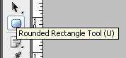
The first step is to create the front of the Mac, to do this simply pick the Rounded Rectangle Tool (shown below) and draw a fairly long rectangle similar to the one below:

The shape is drawn near the bottom of the canvas in order to leave enough room for the rest of the Mac above:

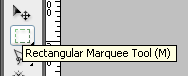
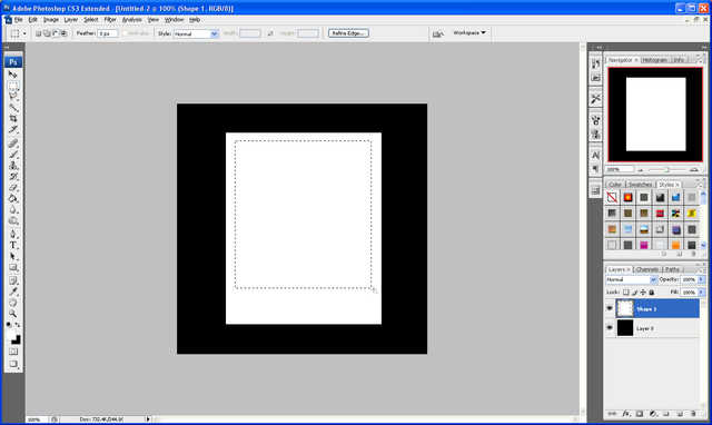
When the shape has been drawn right click the layer in the layers tab and choose rasterize layer this is so that we can erase some of the top, to do this choose the Rectangular Marquee Tool (shown below) and cut off the top of the rectangle with a selection similar to below, this is to get rid of the curved top and create a flat base:

Selection to be made:

Once the above selection has been made press delete on your keyboard to be left with a rounded rectangle with a flat top:

Step 2 - Creating The Keyboard Section
This step will show you how to create the keyboard section for the Mac, this will require us to create some perspective so it looks like it is 3D, First slightly change your foreground colour and then draw a rectangle like below using the normal Rectangle Tool:

Now press CTRL + T to make it so that the shape can be transformed and on one of the anchor points right click to bring up the transformation menu, from this menu choose the Perspective option:

Now when you click and drag one of the anchor points it will make the shape seem to get smaller therefore creating perspective, with this option click the top right anchor point and drag to the left so that you have something similar to below:

Now you have the above shape then you need to make it smaller, so make sure you are out of the transform option by pressing Enter or clicking the Tick Icon in the top toolbar, and simply drag the shape downwards so that it isn’t as tall and you should have something the same as below:

Step 3 - Creating The Screen/Monitor
To create the screen is simple as it is just one rectangle but making sure you get the size right is important as it won’t look realistic if the screen is to big/small so again slightly change the colour of the foreground colour and simply choose the Rounded Rectangle Tool and draw the shape below (Note: After the shape has been drawn simply go to the layers tab and drag it below the keyboard layer so that it doesn’t appear on top of it)
Position in Layers Tab:

Main Screen Drawn:

With this done we now need to create the final main shape which is the inner part of the screen
Step 4 - Creating The Inner Screen
The final main shape to be drawn is the inner part of the screen which again is just a simple rectangle but it’s size and position is important, so as before make sure your using the rounded rectangle tool and drawn the below shape with again a slightly different foreground colour:

Part 2 - Adding The Blending Options
Now we have all of the main shapes we can start to add the blending options to each different shape to make them look more like a MacBook,
Step 1 - Blending Options For The Front
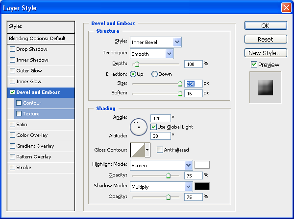
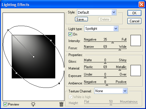
To get the blending options menu up simply double click the chosen layer in the layers tab which will bring up the blending options menu,
Most of the blending options for the layers are similar as to what options to use but the settings for each maybe different so I will just simply put up the screenshot of each setting followed by what it should look like,
Inner Shadow:

Gradient - Set To 90 Degrees:

After applying these settings then your front should look like this:

Step 2 - Blending Options For The Keyboard Area
Inner Shadow:

Gradient - Set To 90 Degrees:

After applying these settings then your keyboard area should look like this:

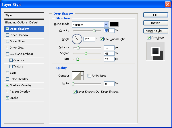
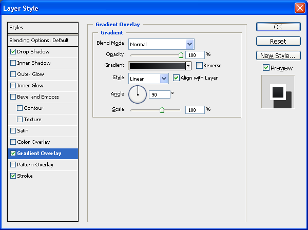
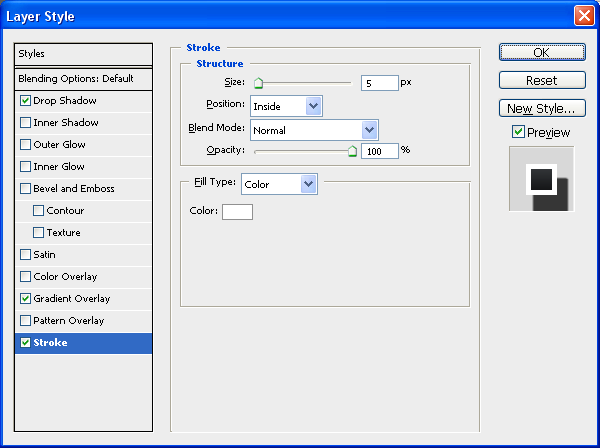
Step 3 - Blending Options For The Outer Screen
Inner Shadow:

Gradient - Set To 90 Degrees:

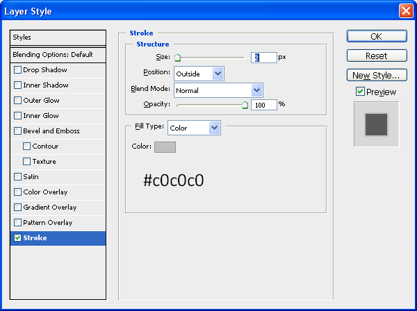
Stroke:

After applying these settings then your Outer Screen should look like this:

Step 4 - Blending Options For The Inner Screen
This being the most simple part all it has is a Stroke as an image will be placed over the top later to make it look more like a desktop screen:
Stroke:

So after all these options have been applied you should have something that resembles a laptop sort of shape and more specifically a MacBook Pro shape and colour, the next section we will start to add some details onto the image.

Part 3 - Adding The Details
Possibly the most time consuming part is adding the little details e.g. buttons, webcam etc…but all of it adds to the realism so lets start with adding a wallpaper to the background,
Step 1 - Adding An Image To The Inner Screen
First thing is first, we need an image to add to the inner screen, so I have just chosen a standard Mac wallpaper that you seem to see everywhere, but for the sake of this tutorial we shall use THIS image
To add it to the inner screen simply copy and paste it into your document and place it directly above the Inner Screen layer in the layers tab,

When it is in the right position simpy right click the wallpaper layer and choose “Create Clipping Mask” which should make it a clipping mask of the Inner Screen layer and just be displayed there as shown below:

Step 2 - Adding The Button on The Front
Now we need to add the button on the front of the Mac which is simply three rounded rectangles inside one another,
Outer Part:
Choose the Rounded Rectangle Tool and set the radius to 20px (Top Toolbar) and draw a rectangle in the middle of the front base the same as below:

Now add the following Blending Options:
Gradient - Set At 0 Degrees:

Stroke:

Now once this is done you should have something the same as below:

Inner Part:
The inner button is pretty much exactly the same as the outer button except it is smaller so it fits inside the outer button and also it has the same blending options except the Stroke is set to 2px instead of just one, use the below image for size referencing:

(Inner) Inner Part:
This is simply just a very small inner rectangle with the colour #717D8A and is placed within the inner part on the left hand side:

Step 3 - Adding The CD Slot
The next part is to add the CD slot onto the front of the Mac, to do this first draw another rounded rectangle with the radius set to 20px, this time draw it on the right hand side of the image and then go on Blending Options and use the same Blending Options as used on the Outer Part of the button, when done you will have something similar to below:

Now we need to add another inner part to the CD drive this is where the CD bit actually goes but there is no blending options needed for this so set the foreground colour to #808080 and draw another rounded rectangle just inside the outer part, use the image below for reference:

Finally for the CD drive we need to add a little slot in the middle so that it looks like a CD can be put inside for this use the Line Tool (Shown below) and set the foreground colour to #6E6E6E and draw a line from the left edge to the right edge so that you have something like below:


Now to finish off the front of the Mac we need to add a little hole, where the headphones plug in (I think I can’t afford a Mac atm so wouldn’t know) to do this simply choose the Elipse Tool and draw a small circle on the left hand side of the button and make sure the foreground colour is set to black (#000000) and there we have finished the front of the Mac as shown below:

Step 4 - Adding The Clips At The Top
These clips are what keep the lid closed and are very simple to create as again it is just a case of using the Rounded Rectangle tool and creating two little rectangles,
1st Rectangle
The first rectangle is simply thin and long and just needs to be black (#000000) place it just to the left of centre at the very top of the screen as shown below (Note: Make sure the radius of the Rounded Rectangle Tool is set to 2px)

2nd Rectangle
This rectangle is the same thickness but also really short and needs to be placed on the very left of the first rectangle and on top, draw it with the foreground colour at #90939B and then go on blending options and set the stroke to the below settings,

When this has been applied you will have something similar to below:

Now all we need to do is the same for just right of centre on the screen so that there is two clips, the best way to do this would be to in the layers tab go on the 1st rectangle and press CTRL + J (Duplicates Layer) and move it across to the other side and then do the same for the 2nd Rectangle, when this has been done you will have the same as below:

After this is done we are nearly there, just the webcam and feet to go,
Step 5 - Adding The Webcam
The simplest thing to add would probably be the Webcam as this is just a black rounded rectangle placed in between the two clips at the top and next to this a little dot which is found on Mac’s make sure the radius is set to 2px and simply add these two features using the below image as reference:

Step 6 - Adding The Feet
The penultimate step to creating the MacBook Pro is to add the feet simply again draw a rounded rectangle underneath the bottom of the Mac just in from the left hand side and make sure it is below your Front Base layer in the layers tab and when this is done simply press CTRL + J and transfer to the right hand side of the Mac and there you go you now have feet:
First Foot:

Second Foot and Progress upto Now:

Step 7 - Writing MacBook Pro
The final main step is to simply write MacBook Pro in the centre of the screen just above the keyboard area I used font Verdana and font size 10, and then when this is done we have our finished MacBook Pro.
Alternatively you could keep going and add a shadow underneath and maybe a reflection, each of which I have written tutorials on:
Reflection
Shadow
And if you wanted to tell people Mac’s are made by Apple then you can add the Apple logo in the centre of the display, and below is the final image which you should have, click the image to see the full size version
UPDATE: Thanks to an email from “Scot”, he sent me a picture of the Mac keyboard which can be implemented into the design first of all here is the picture:
Mac Keyboard
And to insert it onto the current keyboard simply open it up in Photoshop and drag it into your current document as shown below:

Now set the opacity to about 40% of the layer so that you can see through it and now press CTRL + T to go into transform mode, whilst in transform mode right click on one of the anchor points and choose Distort as shown below:

The distort menu allows you to drag the corners of the image in to any position, in this case we are going to drag them onto each corner of the keyboard layer like below:

Using the above method do the same with the other 3 corners so that they each match up with the correct corners, when done press enter or the tick in the top toolbar to apply the transformation and set the opacity back to 100% then you will have something similar to below (Note: Zooming into the corner helps when tryin to be precise)

To finish double click the new keyboard layer to bring up the blending options and use the settings shown below:

When this has been applied then you are complete and we have the final MacBook Pro including the keyboard (Thanks to Scot) and we should have the final image like below:
And as always if you have any problems with this tutorial then don’t hesitate to leave me a comment or email me at: stevie489@googlemail.com and I will help you as much as I can…