Making A Social Bookmark Background
This tutorial will show you how to make the cool image you often see behind the social bookmark links at the bottom of posts on most websites, some are more elaborate than others which helps to make your social bookmarks stand out more, I will show you how to make the background image and what techniques i used in order to get the effect I have ended up with, they are basic steps but ones that can be applied to other situations,
Images You Will Need:
As this is a social bookmarking background we need some images that represent the best social bookmark sites, e.g. Digg, Reddit and Stumbleupon, these can be changed to what bookmarks you prefer or use the most you just need to find your own images, all the images I used are shown below (they all should have Transparent backgrounds so you won’t need to cut them out):
1. Digg
2. StumbleUpon
3. Del.icio.us
4. Reddit
5. RSS Icon
6. Folder Icon
Step 1 - New Document
As always we will start with a new document, for this tutorial I have picked the size of 650 x 200, this is because it best matches my website and it’s sizes so match the sizes you pick to your website (if you are just here for the techniques then use the sizes that I am using)
Step 2 - Draw A Rectangle
For this use the Rounded Rectangle tool (shown below) and draw a rectangle that fits most of your canvas as shown below:
Drawn Rectangle:
Step 3 - Add Blending Options
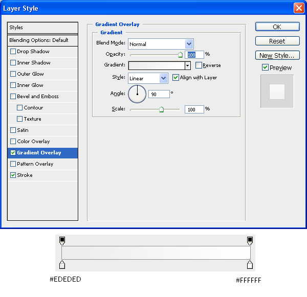
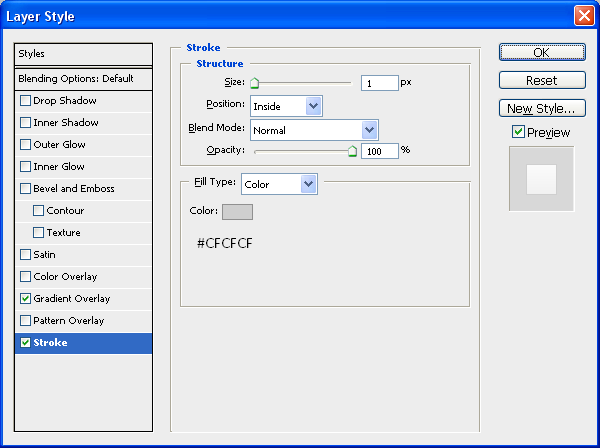
Next we need to add some blending options to the rectangle to make it stand out from the background and look better, I used the settings below, but again this was to match my website so if your website is a different colour or you just want to use a different colour then by all means use what colour you want:
Gradient Settings:
Stroke Settings:
Now you should be left with something like the image below:
Now that we have are main background you can add a shadow underneath it to make it look like a physical presence rather than a flat image by using THIS tutorial which shows you how to add different realistic shadows.
Step 4 - Adding The Icons
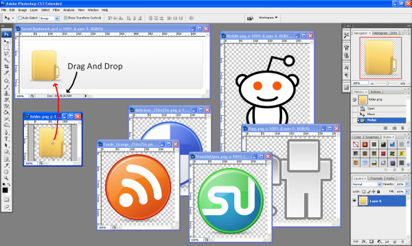
The next step is to add all of the icons to the image making sure that they are in the right positions and at the right size (personal preference) so first make sure you have downloaded all of the icons you need and then make sure they are opened up in Photoshop along with your backround image, to get an image on to your background make sure the Move Tool is selected and simply drag and drop the image onto your image like shown below:
(Note: Once you have placed the image onto the document you can close the original image as you won’t need it anymore and it will create more work room)
Once all images are positioned correctly then you should have something that looks like the below image, if you are following this tutorial to receive the same outcome then use the image below as a guide on where to place the images and what sort of sizes to put them at:
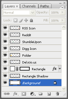
The image below shows the order of the layers which is important to show things appearing in front and behind the folder and rectangle:
Step 5 - Editing The Icons
Next we need to edit a couple of the icons to get the right effect and bring a bit of life into the image,
The Digg Icon
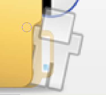
With the Digg icon you can probably see he doesn’t look like he is integrated into the image properly as he is just placed on the top of the folder, to make him look like he is inside the folder looking out we need to rub out a few bits of him
So first make sure that you have the Digg layer selected and then set the opacity of the layer to around 30% this is so that we can see through him and can see the edges of the folder, now we can see this we can pick the eraser tool and rub away the bits that look as though they are infront of the folder the outcome is shown below for reference:
When you have achieved something similar to the above image set the opacity of the layer back to 100% and then you will notice that he looks as though he is part of the image and is looking out of the folder saying “Hello”
The StumbleUpon Icon
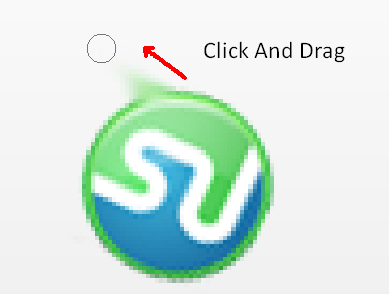
Now we need to change the StumbleUpon icon a little bit in order to make it look like it has fallen out of the folder and is heading towards the floor to do this zoom into the image and make sure that the StumbleUpon layer is selected and then pick the Smudge Tool (Shown Below) and just simply click on the outer edge and drag away as shown below:
This will give the illusion of the Icon falling from the folder, repeat this 3 - 4 times across the shape until you have an image that resembles the outcome below:
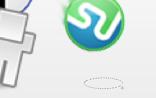
To make the icon look as if it is falling towards the ground we are going to add a shadow on the floor, to do this choose the Eliptical Marquee Tool and draw a oval shape like the one shown below:
Next using the same techniques as in my Realistic Shadows tutorial, create a new layer and fill it with black and set the opacity to around 30% and then deselect by pressing CTRL + D, now go to Filters > Blur > Gaussian Blur and set it to around 3 pixels, this will give a good shadow effect and make it look as if the image is falling towards the ground as shown below:
That is pretty much it, you can add a title like I have done so that people know what it is, (e.g. Save/Promote This Post) and that is the image complete, the final outcome is shown below in my actual social bookmark section.
To get a social bookmarking section like mine and in order to use the image you have just made, follow THIS tutorial that I found when making mine which helped me alot (if you are using WordPress of course)
And you can see a working demo of that and the image below (don’t forget to submit this tutorial whilst your admiring it)
As always if you have any problems with this tutorial then don’t hesitate to leave me a comment or email me at: stevie489@googlemail.com and I will help you as much as I can.











short tutorial, but so nice !
excellent!
oh, i forget, your feedburner 1+… me =)
Nice informatics post. Thanks for sharing.