• Facebook
  • Twitter
  • Flickr
  • RSS

Photoshop Tutorials

Your Number One Place For Photoshop Tutorials, Resources and Inspiration
  • About
  • Contact
  • Home

Simple Web 2.0 Logo

by Steve Tolley

This tutorial is very simple to complete but still gives a nice finish to a cool Web 2.0 style logo for a website etc…only takes around 5 minutes to complete and shows some good techniques which can be used in the future when designing other Web 2.0 Style objects.

Step 1 - Open a New Document

First of all open up a new document size around 500 x 250 and the background filled with black.
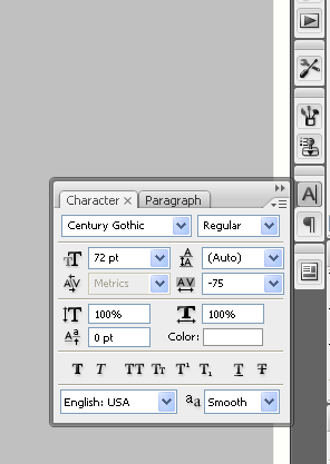
Step 2 - Write Text

Now choose the Type/Text Tool and write out the name of your website or the word you are going to use (I am using the word Photoshop as I normally do and the font “Impact”), when it is written resize to the desired size and put it in the centre of the canvas as shown below:

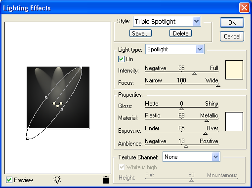
Step 3 - Apply Blending Options

Now simply double click on the text layer and the blending options menu will appear use the settings as shown below to achieve the right outcome:

Stroke:

Colour used for the stroke is: #0052D9

Gradient:

(Other colours can be used, play around with different colours until you get the ones your looking for)

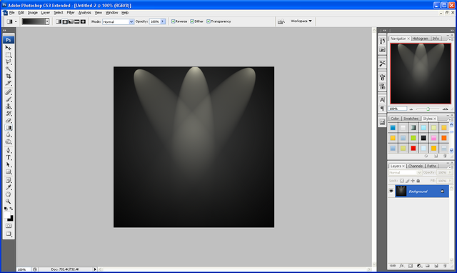
Once the blending options have been applied you will have an image similar to the one shown below (unless you have used different colours etc…)

Step 4 - Add Image/Icon

You can also add images/icons aswell to play around with how the final logo looks in this tutorial I am going to add a Paint icon behind my text which is available below:

Paint Icon:

Step 5 - Finishing Touches

To finish just add some finishing touches like a glow in the background for example and a reflection as shown how to do HERE after you have messed around for a while and are happy with the outcome you will have something similar to below:

Finished Image:

If you have had any problems with this tutorial then don’t hesitate to contact me and I will get back to you as soon as I can.

Category : Text Effects
Tags : Design, Logo, Photoshop, Tutorials, Web 2.0
1 Comm

Logo Design and How To Showcase Your Work

by Steve Tolley

This tutorial will give you some useful tips on how to create a professional looking logo using simple design techniques and how to showcase your work using basic Photoshop lighting options, very useful when looking at logo design for your own website or maybe just to learn abit more how Photoshop works

Showcasing Your Work:

Step 1: First of all create a new document sized 500 x 500, then choose the gradient tool and set the colours to: #000000, #49454d, and make sure that it is a “Radial Gradient” drag the gradient from the middle to one of the corners so the lighter colour is in the middle

Step 2: Now for the lights go to Filter > Render > Lighting Effects and use the settings that are shown below:

You should now have something that looks like the image below:

Step 3: All good logos are a mix of text, colour, design, originality and often simplicity, the one that I created below was simply text and a couple of splatter brushes used to get the paint splatters:

Logo Design:

Step 3(a): First of all get the text tool and write your chosen text (if you are having more than one word then do them on separate layers so they can be easily re arranged if needed) now arrange the text in a way in which you think looks cool and eye catching, you can change the text settings like the spacing between letters etc… From using the options shown below:

Step 3(b): After playing around with the layout and colours of the text I finally found something I was happy with so then proceeded to make the paint splatters, to do this I used these set of brushes HERE and simply played around with the layout and colours again experimenting with different things and blending options etc…until I found something I was happy with (I used separate layers again for each splatter so they could easily be rearranged) as shown below is the result I got after about 30 minutes of messing around and changing my mind:

As you can see it is kind of simple but I feel the layout and colours that were chosen really stand out well and show a sense of professionalism and creativity (these are just my own opinions and I am going to be slightly biased as I did design it, but let me know what you think and if you decide to make a logo of your own based on my tips then please leave me comments on this post showing off your creativity)

Showcasing Your Work (Continued…)

Step 4: With all of the above completed it is time to finish off showcasing your work. To finish simply do a standard reflection on any words on the bottom (in my case the word “Tutorials”) as shown HERE, but instead of doing a linear reflection as shown in that tutorial you need to do a “Radial Gradient” as there is a light source coming from 3 directions and meeting in the middle so the reflection won’t just be in one direction.

And there you have it a completed logo and how to showcase it simply using Photoshop standard lighting, if there is anything you got confused about or need help with then please don’t hesitate to contact me with any queries either by leaving a comment here or emailing me at: stevie489@googlemail.com

Finished Result:

The PSD file is also available if anyone wants to know how to do something or what something looks like then email me at: stevie489@googlemail.com and I will happily mail it back.

Category : Designing
Tags : Design, Logo, Photoshop, Showcasing, Tutorials
7 Comm
  • Stay Updated

    • 533 Twitter Followers
    • 2351 Subcribers
    • 397 Facebook Fans
  • Search

  • Categories

    • Articles (8)
    • Designing (11)
    • General Effects (2)
    • Other/Misc (3)
    • Photo Effects (2)
    • Text Effects (9)
    • Textures (1)
    • The Basics (5)
    • Web Graphics (4)
    • Website News/Updates (2)
  • Popular Posts

    • gallery-user
      User Link Feed

      Hello! Welcome to the User Link Feed. Anyone can submit links with...

    • shape-1
      Creating A Retro Grunge Poster

      This tutorial is an add on from the Poster article the other...

    • front-base
      Creating A Vector Style MacBook From Scratch

      This tutorial is quite a long one, so I would go get...

    • finished
      Paint Splodge Text

      This is just a quick text effect tutorial, This will show you...

    • hdr-gallery
      17 of the Most Visually Beautiful HDR Images

      After a break for a little while, and concentrating on my University...

  • Community News

    • 20 Unique Die Cut Business Cards

      One of the best ways to stand out from other business cards is with a die cut design. When most…

    • Plus21 Design

      Web & Graphic Design business

  • Add Community News

  • Tags

    3D Apple Articles Background Banner Basics Best Blending Options Button Collection Colour Corners Creativity CS3 Depth Design Effect Effects Grunge HDR Icon Image Inspiration JPEG Layer Mask Logo Masking Modern Navigation Pen Photoshop Polaroid Poster Reflection Resources Retro September Showcasing Text Tool Tutorial Tutorials Wallpaper Web 2.0 Website
© Copyright 2011 - Online Photoshop TutorialsTheme by Towfiq I.