Creating Realistic Shadows
This tutorial will show you how to create realistic shadows using simple methods this can be applied to any object that needs a shadow and the same principles apply for each.
Step 1 - New Document
For this tutorial the document size will depend on the object you want to give a shadow to but for the sake of the tutorial I am using 200 x 200 for a small button that I want to give a shadow to.
Step 2 - Drawing The Shape
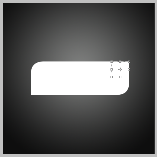
I am going to draw a rounded rectangle which I will use for the shape of the button the rounded rectangle tool is the one shown below and the how to draw the shape is also shown:


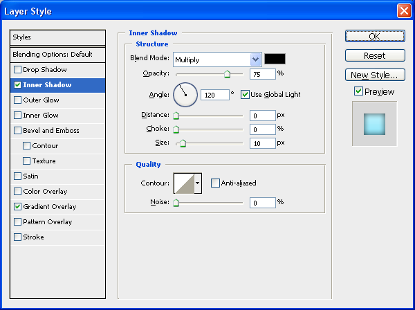
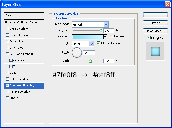
Step 3 - Applying The Blending Options
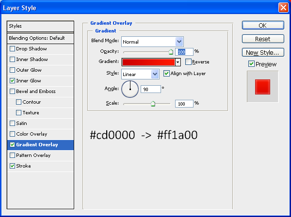
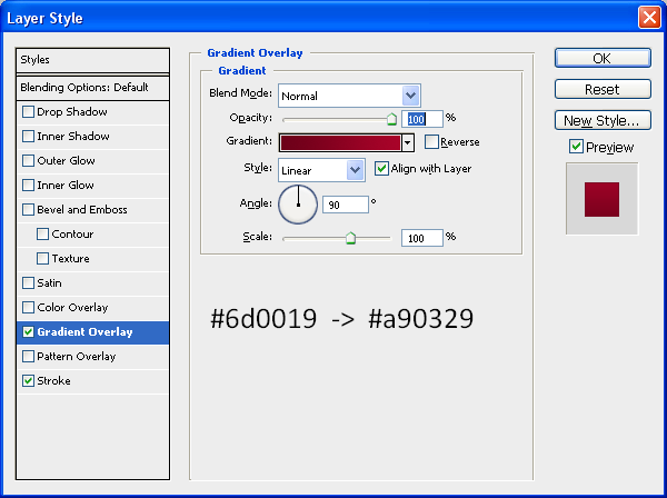
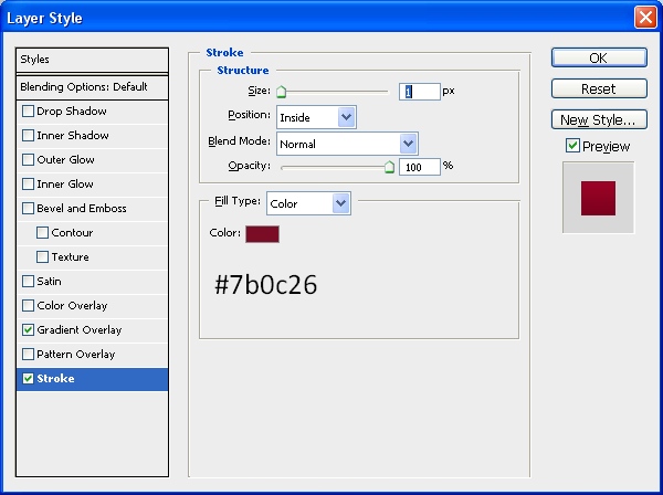
Next we are going to apply the blending options to the shape this will be so the shape looks like a Mac style button but obviously you can apply whatever gradients etc… that you want to get your desired effect:
Gradient:

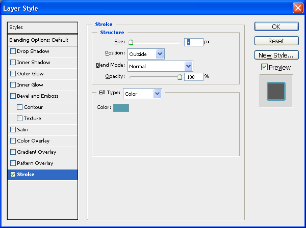
Stroke:

When these options have been applied you should have the same image as shown below, as you can see it looks like a button which could be used for a website (e.g. Navigation)

Step 4 - Creating The Shadow
To create the shadow you need to choose the rectangular marquee tool (shown below) and the then draw a thin box across the bottom of the shape, I have zoomed into the image to better show where to draw the box:

Note: Zoom into the canvas to get a better closer view of what you are doing this allows you to be more precise when sizing things up such as the shadow

When this is done create a new layer (CTRL + SHIFT + N) then fill the selected box with black (#000000) and then deselect (CTRL + D)
Then next thing to do is set the opacity of the shadow so it is lighter (dependent on how dark you want the shadow to be) so I set the opacity of the layer to 30% as it best suited the situation as shown below:

The next and main final step is to blur the shadow so it is not so just a block of colour, to do this go to the top toolbar and go Filter > Blur > Gaussian Blur and then use the settings shown below:

Step 5 - Move The Shadow To Desired Position And Finish
Now that the shadow has been created it can be moved into a desired position there giving the effect of different heights from the surface e.g. as shown below in the 3 examples,


If you have any problems with this tutorial then don’t hesitate to leave me a comment or email me at: stevie489@googlemail.com and I will help you as much as I can.


