User Link Feed

by Steve Tolley

Hello! Welcome to the User Link Feed. Anyone can submit links with a short description which will then appear in the sidebar. Links must be approved before appearing and we filter out links that aren’t relevant to the audience. We generally want:

  • Links to Useful Resources and Downloads
  • Links to Tutorials
  • Links to Inspirational Work (*really good* work only please)
  • Links to Articles

You can submit your links below using the form. They are generally approved within 24 hours.

Making a Compact Disc Icon

by Steve Tolley

This tutorial will show you the steps and techniques used when creating a CD icon which can be used on websites etc… Very useful as the same techniques can be applied when making other icons/images

What We Are Going To Achieve

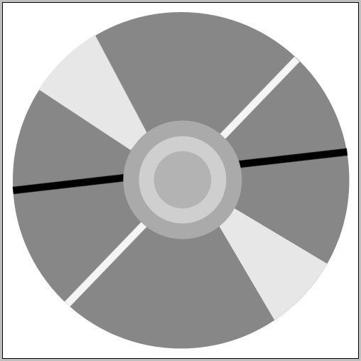
As you can see it looks realistic and it is also vector style so can be scaled easily

Step 1 - Create A New Document

The best thing to do when making an icon is to make a large canvas when designing it as this helps add detail and allows for the image to be scaled later without the worry of pixelating it, bearing this in mind I started out with a canvas of 500×500 so therefore I can scale it down later.

Step 2 - Creating The Basic Shapes

The first thing you need to do is create the basic shapes for the CD and then we will add the stylings later

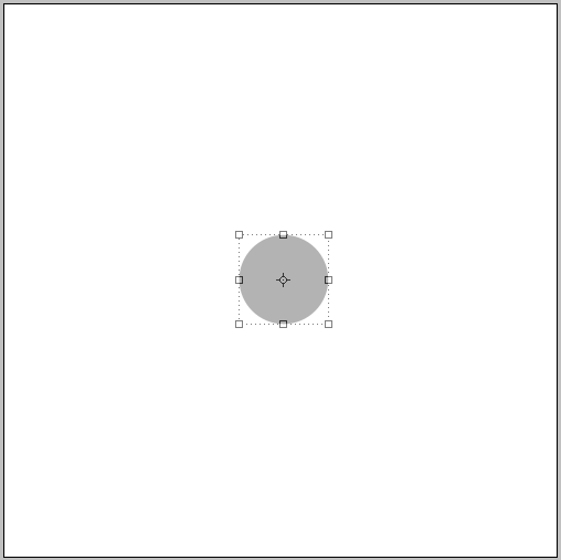
The first shape is a simple circle in the middle of the Canvas, to start with give it a neutral colour and then we can also change this later use the image below as reference:

First Shape:

The next shapes are also simple circles so just use the images below as reference on where to put them and what sizes they all need to be:

Second Shape:

Third Shape:

Fourth Shape:

The next few shapes are different to make as they involve using the perspective tool and rectangles:

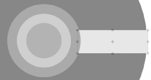
First of all grab the rectangle tool and draw a rectangle like below:

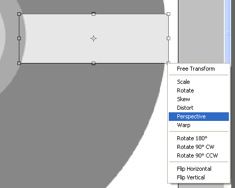
Next press CTRL + T on your keyboard to enter transformation mode, this then allows you to play around with the shape, simply right click on one of the anchors and choose “Perspective”

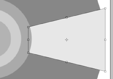
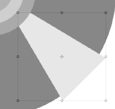
When you are in perspective mode then click on one of the right hand side anchor points and drag either up or down (depending on which anchor point you chose) the idea is to make one side larger than the other:

Now you need to move this rectangle to the desired position, to do this simply rotate the rectangle and place in the position you want, also if needed resize and change perspective:

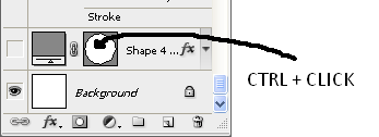
Now we need to make it fit to the outer shape to do this right click the rectangle layer in the layers tab and choose rasterize layer which allows the shape to be edited further, with this done CTRL and CLICK on the preview image of the Fourth Shape in the layers tab, like below:

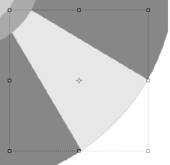
This will give you the crawling ants around the biggest circle which indicated that it is selected, now press CTRL + SHIFT + I to invert the selection and make sure that the rectangle layer is selected in the layers panel and then press delete to get rid of the excess part of the rectangle to leave you with something like below:

Now press CTRL + J to duplicate it then simply rotate it and place it on the other side of the circle so that you have something like below:

Using the same principles as the above 2 rectangles we need to make 4 more, but they dont need to have the perspective added to them, so repeat the last few steps without the perspective steps so that you have something like this:

Step 3 - Adding The Blending Options

Now that we have the basic shapes in place we can start to add the blending options and effects which will then start to give this CD some life,

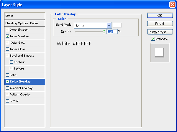
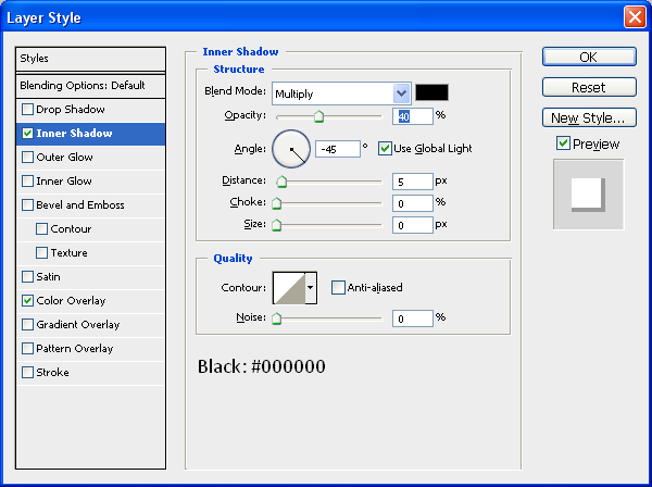
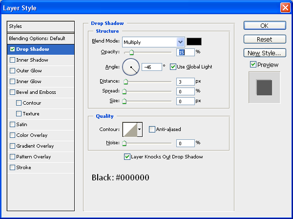
We will start with the first circle shape and work up from there, on this we need to set the colour to white and add a drop inner shadow using the settings below (to access the blending options menu simply double click the desired layer in the layers tab) :

Color Overlay:

Inner Shadow:

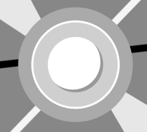
When these blending options have been applied your first shape will look something like this:

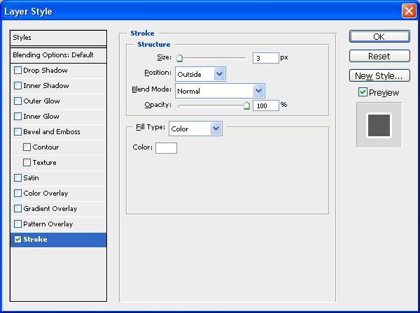
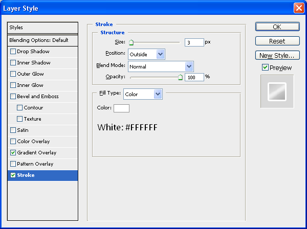
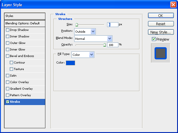
Now to move onto the second shape, on this shape we need to add a colour overlay again using the colour #CFCFCF and the add a stroke which is just plain white (#FFFFFF) and has a size of 3px:

When the color and stroke have been applied you will have something like below:

Now for the third shape we need to add a simple drop shadow, this effect is faint but will add to the final effect:

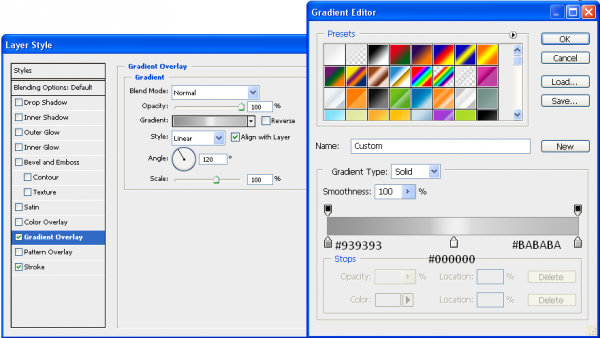
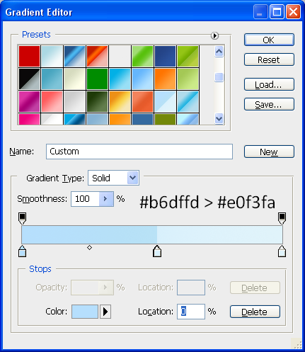
For the biggest circle we need to add the main gradient and a white stroke, for the gradient use the settings below:

And for the stroke you need the settings below:

When these settings have been applied then all of the main basic shapes are done, and you will have something like the image shown below:

Step 4 - Adding Details

To give the overall CD shape a border the best thing to do is to duplicate the biggest circle shape and add a larger stroke to it, this will show the CD to have a grey coloured border, to duplicate just press CTRL + J when the fourth shape (biggest circle) is selected in the layers tab and it will create another exactly the same, then go into the blending options and add a stroke with a size of 6px and colour #B7B7B7, this will give you the image below:

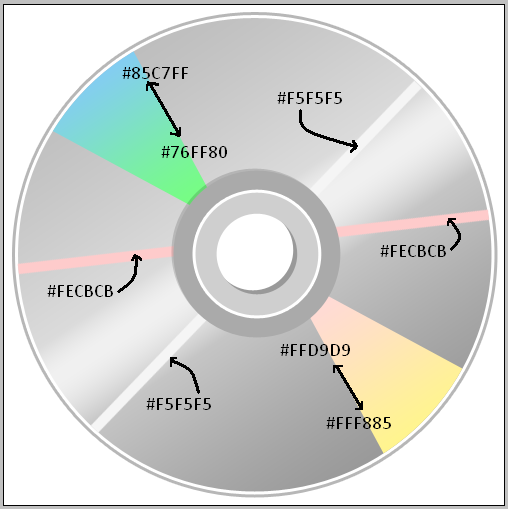
To finish off this CD we need to add some colour to the extra rectangles that we have created, using the image below as a colour reference simply add a colour overlay to each of them with the colours specified, or a gradient overlay if there are 2 colours shown:

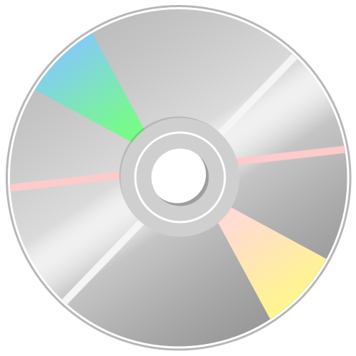
And there you go we are finished! once you have all of the colours and gradients added then you will have a finished CD icon which can be used for many different things, below is the fullsize finished image.

It would be cool to see what you come up with so feel free to upload them to the Photoshop Tutorials Flickr Group and leave me a comment to say when you have uploaded one so people can comment on them,

And as always if you have any problems with this tutorial then don’t hesitate to leave me a comment or email me at: stevie489@googlemail.com and I will help you as much as I can…

Also if you want, this CD will be in an icon pack that I will be releasing soon just leave me a comment and if I get enough people wanting the pack then I will release it when it is completed and I once I have done some more icons.

Monthly Roundup - September 08

by Steve Tolley

September has been a crazy month for me, getting prepared for university, trying to maintain this website, starting university and getting stuck in as well as releasing a second website it has all really kept me on my toes, hence the reason for the lack of posts/tutorials over the past week or two, hopefully things are settling down now and I can resume normal posting, roll on october…

But for now this is a round up of the best of the month just gone:

Tutorials

Lets start off with some of the best tutorials from this month, in no particular order:

Screen Shot Magic - MagnusFX

A great tutorial explaining how to spruce up dull screenshots by introducing some Photoshop magic

The RoboHorse - Tutzor

A very unique tutorial explaining how to turn a normal picture of a horse into a cool looking RoboHorse

Create a Shiny 3D Box - PSVibes

A very cool tutorial on how to make a 3D box icon that can be applied to many different designs/websites

Business Card on a Wooden Texture Table - NaldzGraphics

A nice tutorial showing how to realistically present your business card designs

Vibrant Photo Manipulation - PSDLearning

A fantastic tutorial explaining how to manipulate a photo to give a great colouful end result

Create An Amazing Ad In Photoshop - Abduzeedo

Possibly my favourite tutorial this month not just because of the amazing end result but the simplicity of the techniques used to get such a great effect

Articles

Now for some of the best design based articles, this was tough as there was so many to choose from but I just picked a few:

What Not To Do When Designing A Logo - Brian Yerkes

A great article explaining what not to do when designing a logo, informative and interesting, well worth a read

Web Design Inspiration: Brown - Design Shard

A nice inspirational article for web designers looking at brown coloured sites for inspiration, also Design Shard has just undergone a facelift and looks great check it out…

Talking Typography Part 1 - Arbent

A cool article looking at what different types of typography are used and how they are implemented

Resources

And finally some resources for you all to look at and use,

Out of Focus: 30 Free Bokeh Textures - Lost And Taken

A collection of great textures in the Bokeh style really useful and very nice

20 Free Handwritten Fonts - Fuel Your Creativity

A great collection of handwritten fonts useful for the more personal, scrapbook style look to a design

New Design Websites:

Just a quick shout out about a couple of new design related websites that have popped up this month:

The Creativity Wall

My latest website, that I officially released this month, a showcase for design related articles that will double up as a design database if you are ever looking for a design article or for a particular tutorial then this is the place to go, alternatively if you want to showcase your work here then simply submit it to me and I will upload it as soon as I can, gradually getting more subscribers and visitors per day, so get submitting to increase the amount of articles available…

Vot.eti.me

A great new website from Roger who also owns Styl.eti.me this website however is like a digg style site for designers and creatives, new links everyday and ever growing, well worth submitting your links to to attract fellow designers.

Thats it for September I hope you enjoyed this roundup and lets hope October is as good for the design community and keep the great articles and tutorials coming, I will surely try my best to create some good tutorials in the following month.

Best of The Week - 15th To 21st September

by Steve Tolley

As of this week every sunday I am going to produce a ‘Best of The Week’ Selection where I will look through the weeks top Tutorials, Articles and Resources and produce a list of the best ones found, This being my first some feedback in the comments would be appreciated to say whether or not you like the idea,

Tutorials

Awesome Billiard Balls

Unique 3D Text - Xara 3D + Photoshop

Banging Woofer Embedded In Wood

Pencil It In

Make an Inspiring Artistic Poster

Articles

Your Rights As A Photographer

40+ Creative, Courageous and Campy Buttons

18 Truly Awesome Cool Custom Designer T-Shirts

Resources

Hand Drawn Fonts Collection

10 Beautiful Icon Sets For Web Developers and Designers

35 Tutorials For Mastering Photoshop Brushes

I hope that you have enjoyed this collection from this week and that it helps you along the way, if you want to see a ‘Best of’ every Sunday then leave a comment below saying how much you have enjoyed this one and I will keep on doing them.

The ‘Creativity’ Wallpaper

by Steve Tolley

This tutorial is possibly one of my favourites as I love the outcome, we are going to create a desktop wallpaper with a bit of a difference, we will use a range of techniques and most importantly we are going to use our imagination and creativity skills,

What We Are Going To Achieve

Step 1 - New Document

Create a new document that corresponds to the size of your desktop, mine being 1440 x 900, you can check yours by right clicking on your desktop and choosing Properties from the pop up list.

Step 2 - Radial Gradient Background

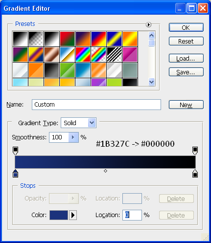
To start we are going to add a radial background to the canvas, to do this pick the gradient tool and make sure it is set to radial gradient (Top toolbar option) and then set your colours to the below:

With the gradient colours set then drag the cursor from the middle of the document to one of the outer corners in order to get a evenly distributed gradient like below:

Step 3 - Write The Text

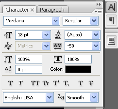
To get the effect so that the “Y” has fallen over you need to write the text seperate, so first of all write the word “Creativit” I have used the font MUSEO which can be found with a quick search in Google and then set the font spacing to “-50″ the font menu can be opened by going to Window > Character on the top toolbar then you can use the settings below:

When you have applied these settings then your text will look like that shown below:

When you have this, then you can write in the Y in a seperate layer, then simply choose the move tool and rotate the Y so that it looks similar to below:

Now that you have the basic layout, you can add some very simple blending options, to do this simply double click the desired text layer and make sure that the drop shadow is ticked and press OK, now do the same for the letter Y and you will have an outcome similar to below:

To add to the effect you can add a simple shadow as shown in the Realistic Shadows tutorial which makes it look as if it is sitting on a floor.

Step 4 - Adding The Spill

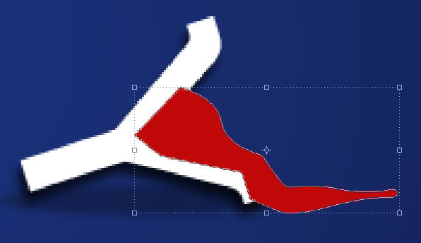
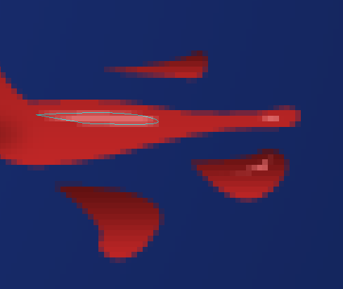
To add the spill make sure your foreground colour is set to a bright colour (I chose RED as that is the colour I wanted the final spill but you can use any colour) and then with the PEN tool selected draw a shape the same as below:

Now move this layer below the letter Y layer in the Layers tab so that it looks as if it is actually spilling out of the letter itself, now we can add the seperate splatters which are simply little shapes drawn with the pen tool, any shape can be drawn and any amount can be drawn it is up to you, also you can use the below image as a reference:

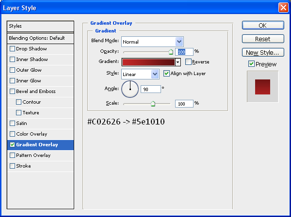
You can also add a gradient to the main spill and the little splatters to get a better effect and add more depth so you can add the Gradient below through the blending options menu:

To finish off the spill you can some highlights as shown below, these are made with the pen tool when the foreground colour is set to a lighter version of the original colour used:

When you have applied these highlights then you will have the finished spill like below:

Step 5 - Adding Broken Cables

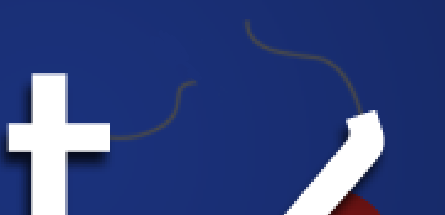
There must be a reason why the letter “Y” has fallen over and spilt the liquid inside…? Well there is the cables that hold it up have snapped, so in this step we are going to make those cables, first of all grab the pen tool and draw a simple path on the end of the horizontal bar on the letter “T” (shown below) once this has been done create a new layer (CTRL + SHIFT + N) and then right click the path you have just made and choose “Stroke Path” and then press OK this will make the path a line created by your brush, now do the same on the top of the letter “Y” and you will have something similar to below:

Apply a simple Drop Shadow through the Blending Options menu and also make sure the cables are white, so if they are not already white, then add a Colour Overlay also through the Blending Options menu and set the colour to white.

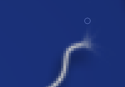
Once the cables are done then we need to make them look as if they are frayed at the ends, so they actually look like they have broken apart, to do this zoom into the end and then choose the Smudge tool from the toolbar (shown below) and simply drag away at the edges so you have something similar to below:

Now do the same to the other part of the cable, once you have done this you will have something similar to below:

Step 6 - Adding The Hat

This step is simple as it is just a case of getting the hat image and inserting it into the document and then positioning it in the right place,

So grab the HAT picture located HERE!

And open it up in Photoshop, when this is done drag it onto your wallpaper document and position on the top left of the letter “C” that is pretty much it as I have already rotated it to the correct angle, but it can be resized/rotated accordingly, when the hat is in place you will have the same as below:

Step 7 - Adding The Liquid In The “V”

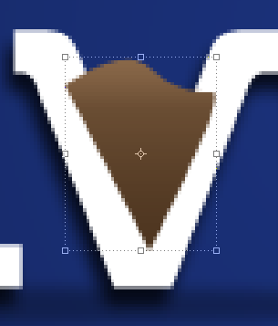
This step is very similar to Step 4 where we adding some liquid/paint to the inside of the letter “V” to do this set your foreground colour to any desired colour that you want and using the Pen Tool again draw a shape like below:

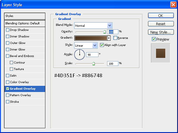
Now drag this layer below your text layer in the layers tab so it looks as though it is inside the letter, and then double click the layer and apply the below gradient (Change the colours if you want to):

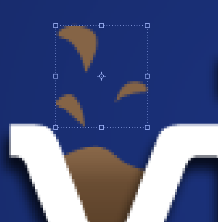
With this gradient applied create some liquid drops so it looks as though something has just fallen in it and splashed it everywhere, use the below image as a reference, once done apply the same gradient to all of these drops:

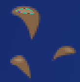
Now you can add the highlights again using the same methods as in Step 4, grab the pen tool and make a shape but make sure the foreground colour is set to a slightly lighter colour than what is on the drop itself, when this is done you will have something similar to below:

When this is done we will have something similar to below and will be left with one final step:

Step 8 - Adding A Slogan/Motto

To finish we are going to add a simple slogan/motto to the bottom right of the word “Creativity” so make sure your foreground colour is set to white and type the text “It’s Amazing What You Can Do…” or something similar and then open up the blending options menu and add a simple drop shadow you are then left with the below:

With this done we are finished, feel free to add more things to it, and experiment with different shapes and words and see what you come up with, if you create something then why not upload it to the “Photoshop Tutorials Flickr Group” so others can see what you have achieved

So now we are finished you should have something that looks like the below:

And as always if you have any problems with this tutorial then don’t hesitate to leave me a comment or email me at: stevie489@googlemail.com and I will help you as much as I can…

Creating A Grungy Banner

by Steve Tolley

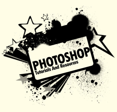
This tutorial will show you how to create a grungy style banner that can be used on posters or on websites, it is a very simple process and therefore quite a short tutorial but offers techniques which can be used on any project,

What We Are Going To Achieve

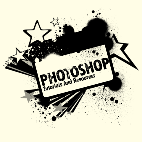
Grungy Banner Done

Step 1 - Create New Document

First of all as always you need to create a new document for this tutorial I have used the sizes 500 x 500 but as normal you can use whatever size is suitable for you, once you have this then fill the document with the colour #FFFDE6

Step 2 - Draw Some Rounded Rectangles

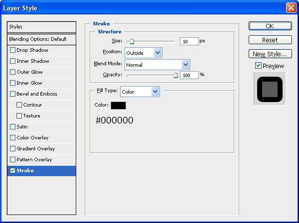
This step is simply to draw 2 rounded rectangles using the rounded rectangle tool (shown below) so make sure that your foreground colour is set to #FFFDE6 and draw a rounded rectangle with a radius of 5px, when this is done double click the new shape in the layers tab which will bring up the blending options menu, with this open use the below settings:

Rectangle Tool

Stroke:

Rectangle Stroke

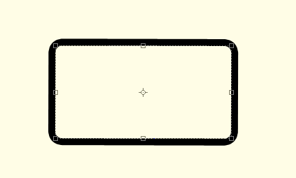
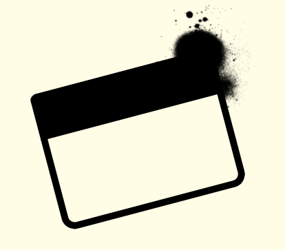
With these settings applied you should have something similar to below:

First Rectangle Done

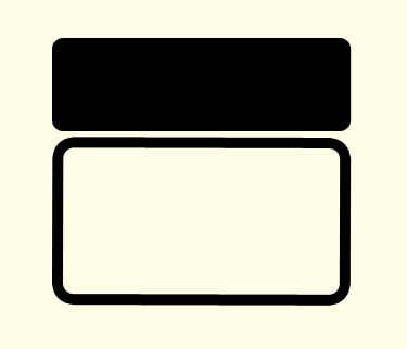
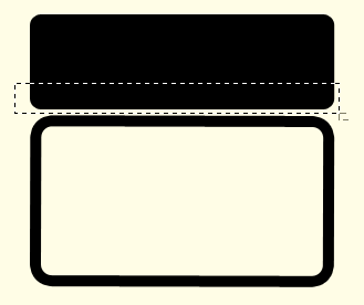
Now we need to draw our second rounded rectangle, this time make sure that the foreground colour is set to black (#000000) and draw a shape the same as below:

Second Rectangle Done

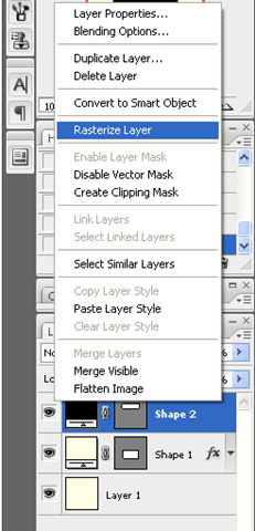
Now right click in the layers panel on the second shape and choose rasterize layer as shown below:

Rasterize Layer

With this done select the Rectangular Marquee Tool (Shown Below) and make a selection the same as what I have done below:

Rectangular Marquee Tool

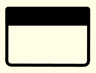
When you have the same selection simply press delete (Note: Make sure that you have the second shape layer selected otherwise it won’t do anything) when this is done you should have a shape with a flat bottom which then needs to be positioned on top of the other shape as shown below:

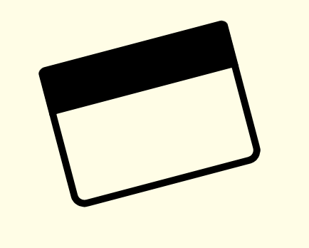
Now to finish off with these two shapes select both of the in the layers tab (CTRL + Click both of the layers) and then choose the Move Tool and rotate the two layers so that you have the outcome below:

Step 3 - Adding The Brushes

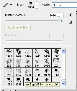
The first brush set we are going to use can be found on Brusheezy but to save you time finding it there is a link to it HERE, once you have downloaded the brushes load them into Photoshop and use the brush shown below:

With this brush selected create a New Layer (CTRL + Shift + N) and set black as your foreground colour and then press the ” [ ” key on your keyboard this will make the brush go smaller, I made mine go to 200px and the applied it to the top right hand corner of the rectangles we created earlier:

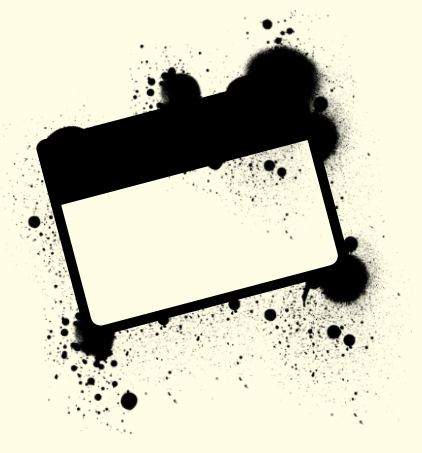
Now you have the basic principle you can play around with the different brushes in the pack and apply them all over the shape, but make sure to create a new layer for each separate brush as this allows you to change them later if needed, when I had finished playing around I had something like below:

Now if you wanted you could change the foreground colour of the brushes and apply some more around the rectangles to make it look more warn like below:

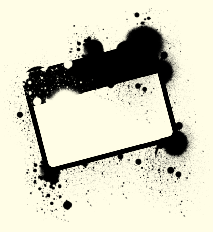
Next we need to add the second set of brushes which can be located and downloaded HERE and then we can start playing around with these brushes, there aren’t a lot in this set so just choose the brushes that you like the best and apply them on your banner, you can use the below image as reference (Note: Make sure the foreground colour is set to black #000000)

As you can see it is just a case of experimenting where you want the brushes to go and where looks good, when you have something you are happy with then we can move onto the final step.

Step 4 - Adding The Text

Now it is just a case of adding some text to the banner I simply added the name of my website like below (Note: I used the Font TW CEN MT Condensed Extra Bold) when the text has been been added simply rotate as before and place inside the of the banner:

Now to finish off you can some more of the splatter brushes over the top of the text which would help make the text look worn and grungy like the rest of the image and when this is done you have the finished product like below, this could be used for posters or websites the list is endless:

And as always if you have any problems with this tutorial then don’t hesitate to leave me a comment or email me at: stevie489@googlemail.com and I will help you as much as I can…

Creating A Vector Style MacBook From Scratch

by Steve Tolley

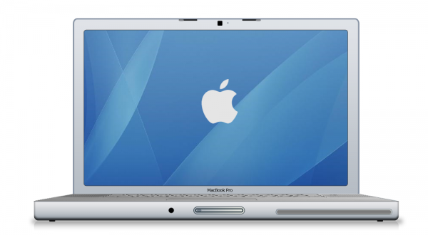
This tutorial is quite a long one, so I would go get a drink now if I were you, OK we are going to make a MacBook Pro in Photoshop using shapes and different blending options, combining these two simple things we get a realistic vector outcome which can be used in many different situations, so…let’s begin,

What We Are Going To Achieve

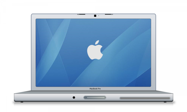
Below is the outcome of this tutorial, as you can see it looks fantastic and it’s not that hard to create…
First of All

Don’f forget to create a new document as always this time I am using the sizes 1000 x 800 to make sure I can add alot of detail to the Mac

Part 1 - Basic Shapes

This section will cover creating the basic shapes for the Mac, so here it doesn’t matter about colours or gradients but make sure to use slightly different colours for each seperate section as not to get confused between them, this combined with giving each layer it’s own name will help to differentiate between them.

Step 1 - Creating The Front

The first step is to create the front of the Mac, to do this simply pick the Rounded Rectangle Tool (shown below) and draw a fairly long rectangle similar to the one below:

The shape is drawn near the bottom of the canvas in order to leave enough room for the rest of the Mac above:
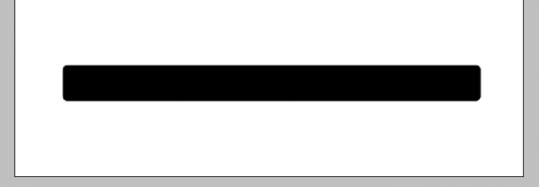
When the shape has been drawn right click the layer in the layers tab and choose rasterize layer this is so that we can erase some of the top, to do this choose the Rectangular Marquee Tool (shown below) and cut off the top of the rectangle with a selection similar to below, this is to get rid of the curved top and create a flat base:

Selection to be made:

Once the above selection has been made press delete on your keyboard to be left with a rounded rectangle with a flat top:

Step 2 - Creating The Keyboard Section

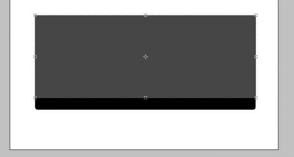
This step will show you how to create the keyboard section for the Mac, this will require us to create some perspective so it looks like it is 3D, First slightly change your foreground colour and then draw a rectangle like below using the normal Rectangle Tool:
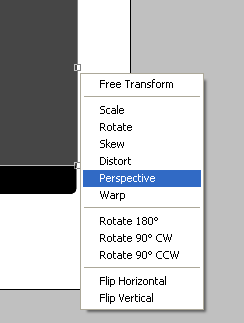
Now press CTRL + T to make it so that the shape can be transformed and on one of the anchor points right click to bring up the transformation menu, from this menu choose the Perspective option:
Now when you click and drag one of the anchor points it will make the shape seem to get smaller therefore creating perspective, with this option click the top right anchor point and drag to the left so that you have something similar to below:
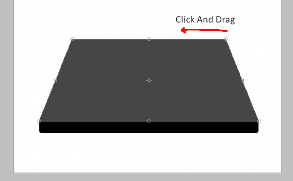
Now you have the above shape then you need to make it smaller, so make sure you are out of the transform option by pressing Enter or clicking the Tick Icon in the top toolbar, and simply drag the shape downwards so that it isn’t as tall and you should have something the same as below:

Step 3 - Creating The Screen/Monitor

To create the screen is simple as it is just one rectangle but making sure you get the size right is important as it won’t look realistic if the screen is to big/small so again slightly change the colour of the foreground colour and simply choose the Rounded Rectangle Tool and draw the shape below (Note: After the shape has been drawn simply go to the layers tab and drag it below the keyboard layer so that it doesn’t appear on top of it)

Position in Layers Tab:
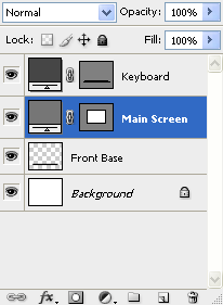
Main Screen Drawn:
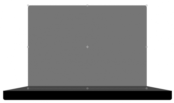
With this done we now need to create the final main shape which is the inner part of the screen

Step 4 - Creating The Inner Screen

The final main shape to be drawn is the inner part of the screen which again is just a simple rectangle but it’s size and position is important, so as before make sure your using the rounded rectangle tool and drawn the below shape with again a slightly different foreground colour:
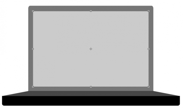
Part 2 - Adding The Blending Options

Now we have all of the main shapes we can start to add the blending options to each different shape to make them look more like a MacBook,

Step 1 - Blending Options For The Front

To get the blending options menu up simply double click the chosen layer in the layers tab which will bring up the blending options menu,

Most of the blending options for the layers are similar as to what options to use but the settings for each maybe different so I will just simply put up the screenshot of each setting followed by what it should look like,

Inner Shadow:
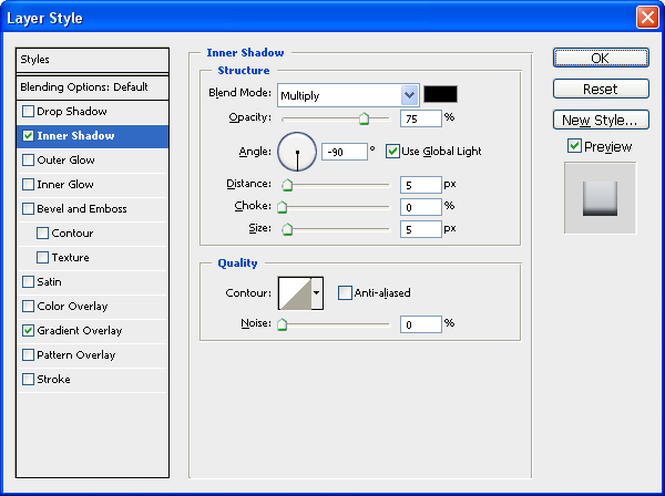
Gradient - Set To 90 Degrees:
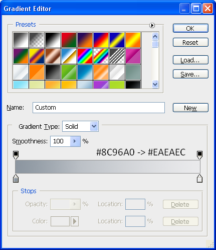
After applying these settings then your front should look like this:

Step 2 - Blending Options For The Keyboard Area

Inner Shadow:
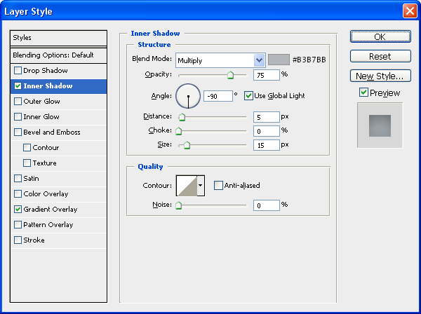
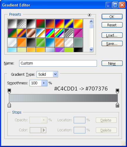
Gradient - Set To 90 Degrees:
After applying these settings then your keyboard area should look like this:

Step 3 - Blending Options For The Outer Screen

Inner Shadow:
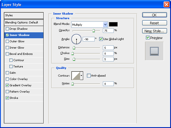
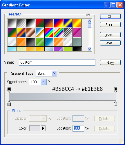
Gradient - Set To 90 Degrees:
Stroke:
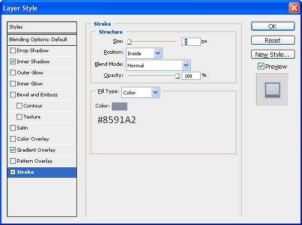
After applying these settings then your Outer Screen should look like this:
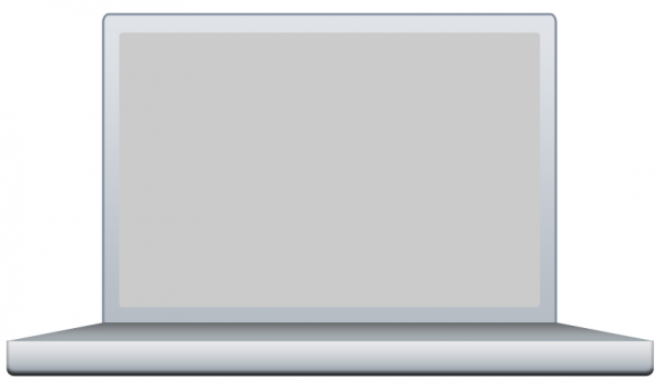
Step 4 - Blending Options For The Inner Screen

This being the most simple part all it has is a Stroke as an image will be placed over the top later to make it look more like a desktop screen:

Stroke:

So after all these options have been applied you should have something that resembles a laptop sort of shape and more specifically a MacBook Pro shape and colour, the next section we will start to add some details onto the image.
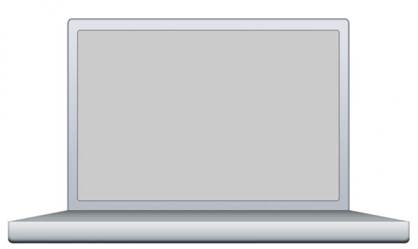
Part 3 - Adding The Details

Possibly the most time consuming part is adding the little details e.g. buttons, webcam etc…but all of it adds to the realism so lets start with adding a wallpaper to the background,

Step 1 - Adding An Image To The Inner Screen

First thing is first, we need an image to add to the inner screen, so I have just chosen a standard Mac wallpaper that you seem to see everywhere, but for the sake of this tutorial we shall use THIS image

To add it to the inner screen simply copy and paste it into your document and place it directly above the Inner Screen layer in the layers tab,
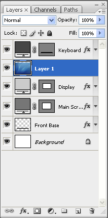
When it is in the right position simpy right click the wallpaper layer and choose “Create Clipping Mask” which should make it a clipping mask of the Inner Screen layer and just be displayed there as shown below:

Step 2 - Adding The Button on The Front

Now we need to add the button on the front of the Mac which is simply three rounded rectangles inside one another,

Outer Part:

Choose the Rounded Rectangle Tool and set the radius to 20px (Top Toolbar) and draw a rectangle in the middle of the front base the same as below:
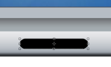
Now add the following Blending Options:

Gradient - Set At 0 Degrees:
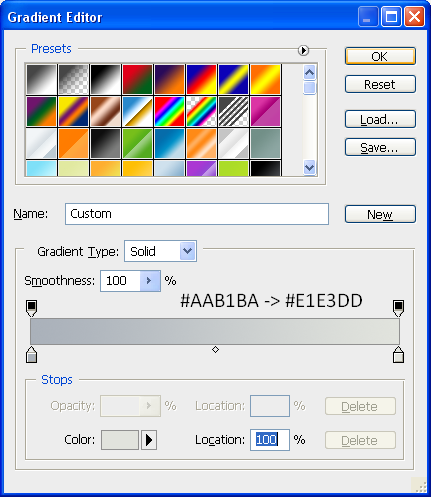
Stroke:
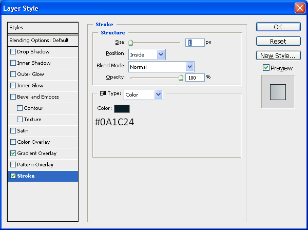
Now once this is done you should have something the same as below:

Inner Part:

The inner button is pretty much exactly the same as the outer button except it is smaller so it fits inside the outer button and also it has the same blending options except the Stroke is set to 2px instead of just one, use the below image for size referencing:

(Inner) Inner Part:

This is simply just a very small inner rectangle with the colour #717D8A and is placed within the inner part on the left hand side:

Step 3 - Adding The CD Slot

The next part is to add the CD slot onto the front of the Mac, to do this first draw another rounded rectangle with the radius set to 20px, this time draw it on the right hand side of the image and then go on Blending Options and use the same Blending Options as used on the Outer Part of the button, when done you will have something similar to below:

Now we need to add another inner part to the CD drive this is where the CD bit actually goes but there is no blending options needed for this so set the foreground colour to #808080 and draw another rounded rectangle just inside the outer part, use the image below for reference:

Finally for the CD drive we need to add a little slot in the middle so that it looks like a CD can be put inside for this use the Line Tool (Shown below) and set the foreground colour to #6E6E6E and draw a line from the left edge to the right edge so that you have something like below:

Now to finish off the front of the Mac we need to add a little hole, where the headphones plug in (I think I can’t afford a Mac atm so wouldn’t know) to do this simply choose the Elipse Tool and draw a small circle on the left hand side of the button and make sure the foreground colour is set to black (#000000) and there we have finished the front of the Mac as shown below:
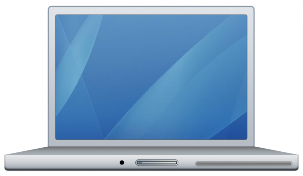
Step 4 - Adding The Clips At The Top

These clips are what keep the lid closed and are very simple to create as again it is just a case of using the Rounded Rectangle tool and creating two little rectangles,

1st Rectangle

The first rectangle is simply thin and long and just needs to be black (#000000) place it just to the left of centre at the very top of the screen as shown below (Note: Make sure the radius of the Rounded Rectangle Tool is set to 2px)

2nd Rectangle

This rectangle is the same thickness but also really short and needs to be placed on the very left of the first rectangle and on top, draw it with the foreground colour at #90939B and then go on blending options and set the stroke to the below settings,
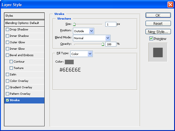
When this has been applied you will have something similar to below:

Now all we need to do is the same for just right of centre on the screen so that there is two clips, the best way to do this would be to in the layers tab go on the 1st rectangle and press CTRL + J (Duplicates Layer) and move it across to the other side and then do the same for the 2nd Rectangle, when this has been done you will have the same as below:

After this is done we are nearly there, just the webcam and feet to go,

Step 5 - Adding The Webcam

The simplest thing to add would probably be the Webcam as this is just a black rounded rectangle placed in between the two clips at the top and next to this a little dot which is found on Mac’s make sure the radius is set to 2px and simply add these two features using the below image as reference:

Step 6 - Adding The Feet

The penultimate step to creating the MacBook Pro is to add the feet simply again draw a rounded rectangle underneath the bottom of the Mac just in from the left hand side and make sure it is below your Front Base layer in the layers tab and when this is done simply press CTRL + J and transfer to the right hand side of the Mac and there you go you now have feet:

First Foot:
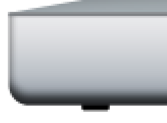
Second Foot and Progress upto Now:
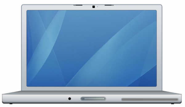
Step 7 - Writing MacBook Pro

The final main step is to simply write MacBook Pro in the centre of the screen just above the keyboard area I used font Verdana and font size 10, and then when this is done we have our finished MacBook Pro.

Alternatively you could keep going and add a shadow underneath and maybe a reflection, each of which I have written tutorials on:

Reflection

Shadow

And if you wanted to tell people Mac’s are made by Apple then you can add the Apple logo in the centre of the display, and below is the final image which you should have, click the image to see the full size version
UPDATE: Thanks to an email from “Scot”, he sent me a picture of the Mac keyboard which can be implemented into the design first of all here is the picture:

Mac Keyboard

And to insert it onto the current keyboard simply open it up in Photoshop and drag it into your current document as shown below:
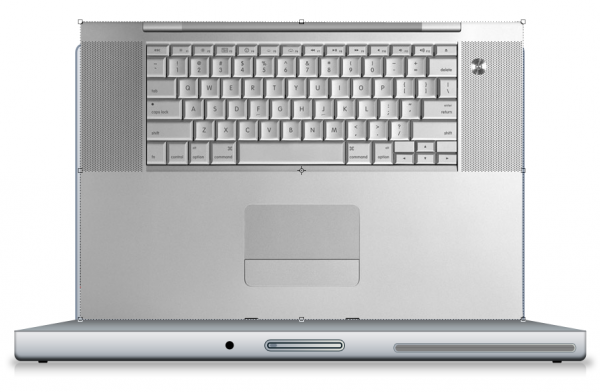
Now set the opacity to about 40% of the layer so that you can see through it and now press CTRL + T to go into transform mode, whilst in transform mode right click on one of the anchor points and choose Distort as shown below:
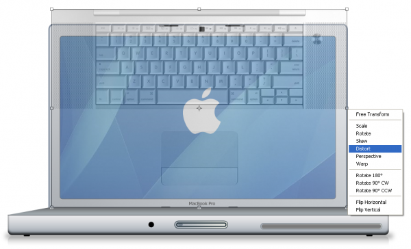
The distort menu allows you to drag the corners of the image in to any position, in this case we are going to drag them onto each corner of the keyboard layer like below:
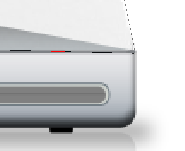
Using the above method do the same with the other 3 corners so that they each match up with the correct corners, when done press enter or the tick in the top toolbar to apply the transformation and set the opacity back to 100% then you will have something similar to below (Note: Zooming into the corner helps when tryin to be precise)
To finish double click the new keyboard layer to bring up the blending options and use the settings shown below:
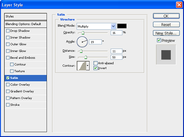
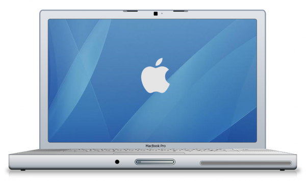
When this has been applied then you are complete and we have the final MacBook Pro including the keyboard (Thanks to Scot) and we should have the final image like below:

And as always if you have any problems with this tutorial then don’t hesitate to leave me a comment or email me at: stevie489@googlemail.com and I will help you as much as I can…
Making A Social Bookmark Background

by Steve Tolley

This tutorial will show you how to make the cool image you often see behind the social bookmark links at the bottom of posts on most websites, some are more elaborate than others which helps to make your social bookmarks stand out more, I will show you how to make the background image and what techniques i used in order to get the effect I have ended up with, they are basic steps but ones that can be applied to other situations,

Images You Will Need:

As this is a social bookmarking background we need some images that represent the best social bookmark sites, e.g. Digg, Reddit and Stumbleupon, these can be changed to what bookmarks you prefer or use the most you just need to find your own images, all the images I used are shown below (they all should have Transparent backgrounds so you won’t need to cut them out):

1. Digg

2. StumbleUpon

3. Del.icio.us

4. Reddit

5. RSS Icon

6. Folder Icon

Step 1 - New Document

As always we will start with a new document, for this tutorial I have picked the size of 650 x 200, this is because it best matches my website and it’s sizes so match the sizes you pick to your website (if you are just here for the techniques then use the sizes that I am using)

Step 2 - Draw A Rectangle

For this use the Rounded Rectangle tool (shown below) and draw a rectangle that fits most of your canvas as shown below:

Drawn Rectangle:

Step 3 - Add Blending Options

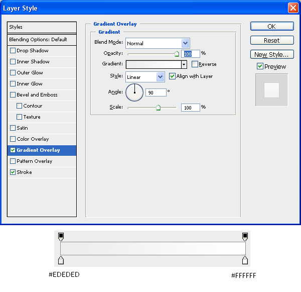
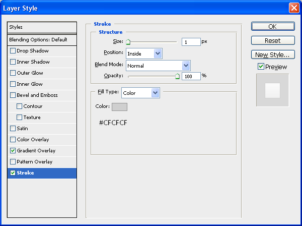
Next we need to add some blending options to the rectangle to make it stand out from the background and look better, I used the settings below, but again this was to match my website so if your website is a different colour or you just want to use a different colour then by all means use what colour you want:

Gradient Settings:

Stroke Settings:

Now you should be left with something like the image below:

Now that we have are main background you can add a shadow underneath it to make it look like a physical presence rather than a flat image by using THIS tutorial which shows you how to add different realistic shadows.

Step 4 - Adding The Icons

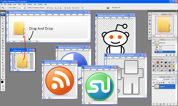
The next step is to add all of the icons to the image making sure that they are in the right positions and at the right size (personal preference) so first make sure you have downloaded all of the icons you need and then make sure they are opened up in Photoshop along with your backround image, to get an image on to your background make sure the Move Tool is selected and simply drag and drop the image onto your image like shown below:

(Note: Once you have placed the image onto the document you can close the original image as you won’t need it anymore and it will create more work room)

Once all images are positioned correctly then you should have something that looks like the below image, if you are following this tutorial to receive the same outcome then use the image below as a guide on where to place the images and what sort of sizes to put them at:

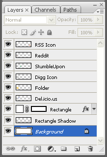
The image below shows the order of the layers which is important to show things appearing in front and behind the folder and rectangle:

Step 5 - Editing The Icons

Next we need to edit a couple of the icons to get the right effect and bring a bit of life into the image,

The Digg Icon

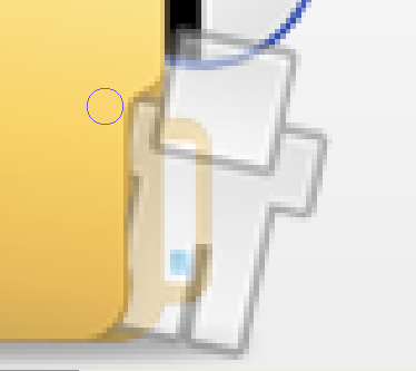
With the Digg icon you can probably see he doesn’t look like he is integrated into the image properly as he is just placed on the top of the folder, to make him look like he is inside the folder looking out we need to rub out a few bits of him

So first make sure that you have the Digg layer selected and then set the opacity of the layer to around 30% this is so that we can see through him and can see the edges of the folder, now we can see this we can pick the eraser tool and rub away the bits that look as though they are infront of the folder the outcome is shown below for reference:

When you have achieved something similar to the above image set the opacity of the layer back to 100% and then you will notice that he looks as though he is part of the image and is looking out of the folder saying “Hello”

The StumbleUpon Icon

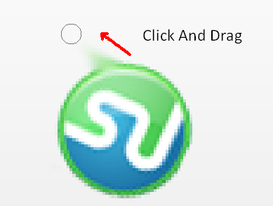
Now we need to change the StumbleUpon icon a little bit in order to make it look like it has fallen out of the folder and is heading towards the floor to do this zoom into the image and make sure that the StumbleUpon layer is selected and then pick the Smudge Tool (Shown Below) and just simply click on the outer edge and drag away as shown below:

This will give the illusion of the Icon falling from the folder, repeat this 3 - 4 times across the shape until you have an image that resembles the outcome below:

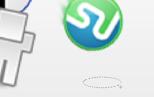
To make the icon look as if it is falling towards the ground we are going to add a shadow on the floor, to do this choose the Eliptical Marquee Tool and draw a oval shape like the one shown below:

Next using the same techniques as in my Realistic Shadows tutorial, create a new layer and fill it with black and set the opacity to around 30% and then deselect by pressing CTRL + D, now go to Filters > Blur > Gaussian Blur and set it to around 3 pixels, this will give a good shadow effect and make it look as if the image is falling towards the ground as shown below:

That is pretty much it, you can add a title like I have done so that people know what it is, (e.g. Save/Promote This Post) and that is the image complete, the final outcome is shown below in my actual social bookmark section.

To get a social bookmarking section like mine and in order to use the image you have just made, follow THIS tutorial that I found when making mine which helped me alot (if you are using WordPress of course)

And you can see a working demo of that and the image below (don’t forget to submit this tutorial whilst your admiring it)

As always if you have any problems with this tutorial then don’t hesitate to leave me a comment or email me at: stevie489@googlemail.com and I will help you as much as I can.

The New Website

by Steve Tolley

WordPress…

As you can probably see the website has changed, as I was promising for quite a while on the old website I was working on a new design, and this is the outcome, so far I havent finished absolutely everything yet as there is still some pages and posts that need to be arranged and added, but I thought I would get most of it uploaded and then finish it from there.

I hope you all like it and any feedback/criticism would be much appreciated, as I need to know of any errors or invalid links/images so if you find any either contact me via the contact form or leave me a comment on this post and I will do my best to fix it.

Also now this is up it means I can start doing some more posts again and upload some more of my tutorials,

There is also a new page on the website called “Your Tutorials” this section is for you to request a tutorial or upload one of your own using the included form (which needs tweaking still) as I am always happy to be helped when writing them as it is difficult to keep on top of this and my studies aswell so any help would be appreciated,

Thanks and happy Photoshopping,
Steve

Bringing Backgrounds To Life Part 1

by Steve Tolley

OK my first tutorial for quite a while now, after successfully securing a place in university I am ready to start posting again whilst looking for a decent host for my new website design (any help appreciated) to get me back into the swing of things I am going to do a relatively easy tutorial to start with, but one I think is very useful when making any type of image that looks a bit plain and boring, the best way to make these sorts of images look better is to simply apply a texture over the top of your background or specific part of the document (e.g. Text) and it is much easier than you may think

Applying a Texture to a Background.

Step 1 - Make a Gradient

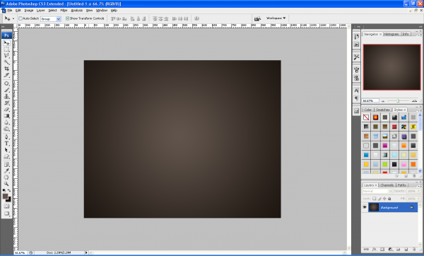
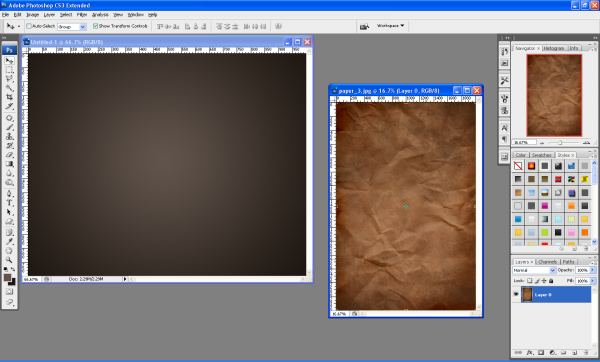
First of all below we have the plain and boring background which I made with neutral colours and a simple lighting effect (Filter > Render > Lighting Effects) in the middle of the canvas.

Step 2 - Drag And Drop Texture Onto Background

Next we simply open up the texture we want to use and drag and drop it on the background we are using (make sure the texture layer shows “Layer 0” or something similar and not “Background” if this is the case double click the layer and then click OK)

Step 3 - Desaturate The Texture

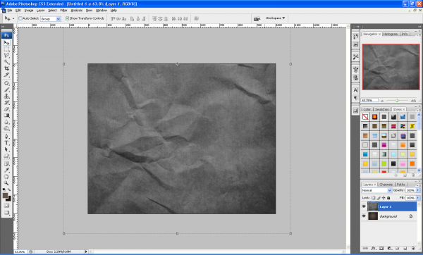
Next position the texture on the canvas so you get the desired effect and then press CTRL + SHIFT + U this combination will desaturate the selected layer / texture

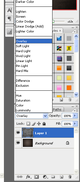
Step 4 - Set Layer Style To Overlay

Now set the layer style to “Overlay” as shown below and adjust the opacity accordingly to get the effect (depth of detail) that you want.

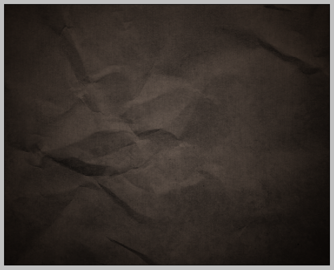
Step 5 - Finished

And now the plain and boring background is brought to life by simply adding a texture which adds depth to the image.

This tutorial is the first part of a series that will explain how else you can bring your images/backgrounds to life, sign up to the RSS feed to receive updates when these tutorials are released,

The texture used in this tutorial is available HERE along with 3 other paper style textures,

If you have had any problems with this tutorial and would like some help then don’t hesitate to contact me either by leaving a comment below, or e-mailing me at: stevie489@googlemail.com

Using The Pen Tool - The Basics

by Steve Tolley

This tutorial is more for the beginners of Photoshop on how to use the pen tool and what you can do with it, although some more advanced with Photoshop may also find this useful, it is just a quick tutorial today as I am currently working on a new WordPress layout for this website so I am quite occupied with that, but I will still be doing tutorials every other day whilst I am doing this.

Step 1 - Find Image

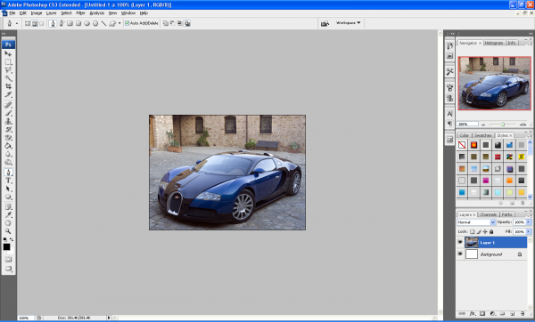
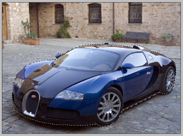
First of all find the image that you want to use in this tutorial; I have used a picture of a Buggati Veyron and open it up in Photoshop, now choose the pen tool on the left toolbar (as shown below) but before we use it I am going to explain what it does and the benefits of using it:

Original Image:

Pen Tool

The pen tool allows you to make “paths” which can be used to cut out certain parts of images or so that you can make a range of different shapes.

Advantages of Using the Pen Tool

The pen tool offers more flexibility over other tools (e.g. Polygonal Lasso Tool) because the pen tool not only creates anchor points but when you have clicked where you want the anchor point to be, if you hold down the button and drag you can create a curved shape which can be used to draw around curved objects.

Step 1 (Continued…): Now back to step 1, with the pen tool selected at the top of the window you will see the below toolbar which shows the settings of the pen which can be used, if you hover over each setting it will explain what they do, for now use the settings below and you can experiment whenever you want to:

Step 2 - Using The Pen Tool

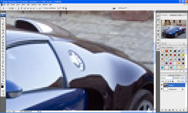
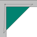
Now zoom into your image and click on the canvas around the edge of your chosen object, this is the starting point of your selection now when you click at the next point in your object notice that it makes another small square (You might notice you can’t click on the adjustment bar ends. That is, until you hold the CTRL key. When you hold the CTRL key, your cursor will change to a solid white arrow, the Direct Selection Tool. Now you can click on the adjustment bar ends and adjust the curve of your selection. Now try holding the ALT key. You should get a two-sided arrow when you mouse over your adjustment ends, the Convert Point Tool. Click and drag to adjust only one aspect of your curve. This is how you make sharp edges with your Pen Path.) Now keep clicking around the edge of your chosen object and remember if you want a curved line, click and hold and then drag in the direction of the curve.

Step 3 - Connect The Two End Points

When you get the hang of it, it is really easy to use, once you have gone around the whole outer edge of your object join the starting point and ending point together, you will now have a “Path”

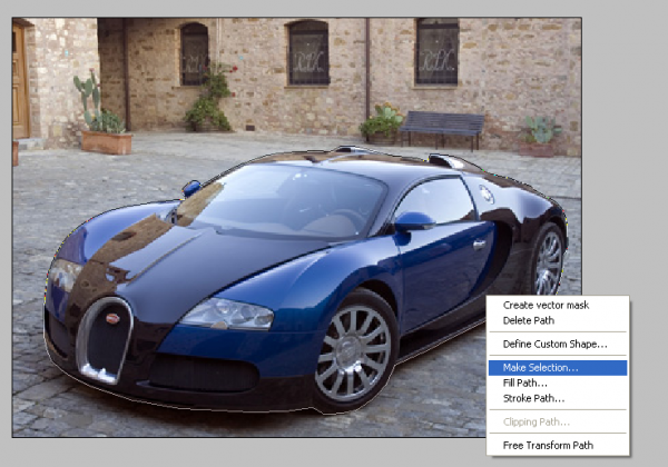
Step 4 - Make Selection

Now right click in the path and choose “Make Selection” as shown below,

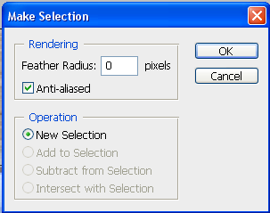
Step 5 - Make Selection Menu

This will bring up a menu showing some different settings, but leave this as default as they don’t need to be changed.

Step 6 - Drag And Drop Image Onto New Background

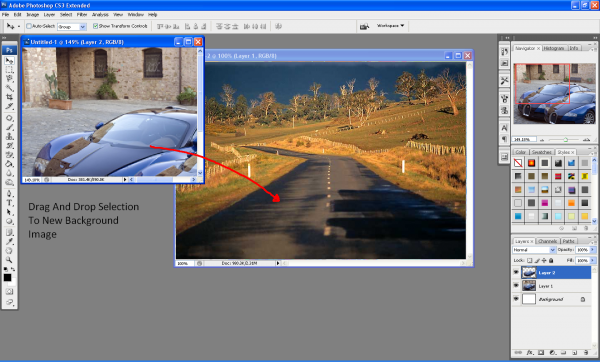
With your path now selected you will see the crawling ants around the edge of your image, now when you choose the move tool you can see that your selection can be moved around etc…Now open up a new background in a new document and simply drag and drop your selection into it as shown below:

Crawling Ants:

Drag And Drop:

Step 7 - Play Around With The Final Image

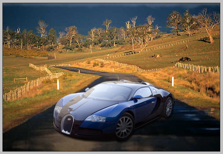
You can now play around with different shadows and options to get just the right look and once I had done this I had something that looked similar to below:
(This final image does look rubbish but that was not the point of this tutorial, the point was to show you that there are other ways to extract an image rather than using the eraser or magic wand tool, if I had more time i would have made this final image look better, but it will do to illustrate my point)

Finished:

This tutorial was just the basics of using the Pen Tool but there are lots of other different things which it can be used for, so go and play around with it and see what you can create.

If you have any problems with this tutorial then don’t hesitate to leave me a comment or email me at: stevie489@googlemail.com and I will help you as much as I can.

Pages:12»