Monthly Roundup - September 08

by Steve Tolley

September has been a crazy month for me, getting prepared for university, trying to maintain this website, starting university and getting stuck in as well as releasing a second website it has all really kept me on my toes, hence the reason for the lack of posts/tutorials over the past week or two, hopefully things are settling down now and I can resume normal posting, roll on october…

But for now this is a round up of the best of the month just gone:

Tutorials

Lets start off with some of the best tutorials from this month, in no particular order:

Screen Shot Magic - MagnusFX

A great tutorial explaining how to spruce up dull screenshots by introducing some Photoshop magic

The RoboHorse - Tutzor

A very unique tutorial explaining how to turn a normal picture of a horse into a cool looking RoboHorse

Create a Shiny 3D Box - PSVibes

A very cool tutorial on how to make a 3D box icon that can be applied to many different designs/websites

Business Card on a Wooden Texture Table - NaldzGraphics

A nice tutorial showing how to realistically present your business card designs

Vibrant Photo Manipulation - PSDLearning

A fantastic tutorial explaining how to manipulate a photo to give a great colouful end result

Create An Amazing Ad In Photoshop - Abduzeedo

Possibly my favourite tutorial this month not just because of the amazing end result but the simplicity of the techniques used to get such a great effect

Articles

Now for some of the best design based articles, this was tough as there was so many to choose from but I just picked a few:

What Not To Do When Designing A Logo - Brian Yerkes

A great article explaining what not to do when designing a logo, informative and interesting, well worth a read

Web Design Inspiration: Brown - Design Shard

A nice inspirational article for web designers looking at brown coloured sites for inspiration, also Design Shard has just undergone a facelift and looks great check it out…

Talking Typography Part 1 - Arbent

A cool article looking at what different types of typography are used and how they are implemented

Resources

And finally some resources for you all to look at and use,

Out of Focus: 30 Free Bokeh Textures - Lost And Taken

A collection of great textures in the Bokeh style really useful and very nice

20 Free Handwritten Fonts - Fuel Your Creativity

A great collection of handwritten fonts useful for the more personal, scrapbook style look to a design

New Design Websites:

Just a quick shout out about a couple of new design related websites that have popped up this month:

The Creativity Wall

My latest website, that I officially released this month, a showcase for design related articles that will double up as a design database if you are ever looking for a design article or for a particular tutorial then this is the place to go, alternatively if you want to showcase your work here then simply submit it to me and I will upload it as soon as I can, gradually getting more subscribers and visitors per day, so get submitting to increase the amount of articles available…

Vot.eti.me

A great new website from Roger who also owns Styl.eti.me this website however is like a digg style site for designers and creatives, new links everyday and ever growing, well worth submitting your links to to attract fellow designers.

Thats it for September I hope you enjoyed this roundup and lets hope October is as good for the design community and keep the great articles and tutorials coming, I will surely try my best to create some good tutorials in the following month.

Creating A Grungy Banner

by Steve Tolley

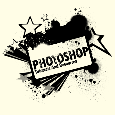
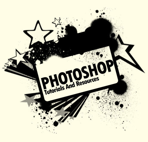
This tutorial will show you how to create a grungy style banner that can be used on posters or on websites, it is a very simple process and therefore quite a short tutorial but offers techniques which can be used on any project,

What We Are Going To Achieve

Grungy Banner Done

Step 1 - Create New Document

First of all as always you need to create a new document for this tutorial I have used the sizes 500 x 500 but as normal you can use whatever size is suitable for you, once you have this then fill the document with the colour #FFFDE6

Step 2 - Draw Some Rounded Rectangles

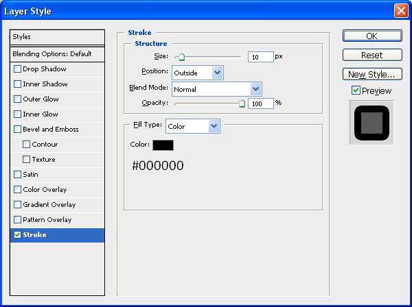
This step is simply to draw 2 rounded rectangles using the rounded rectangle tool (shown below) so make sure that your foreground colour is set to #FFFDE6 and draw a rounded rectangle with a radius of 5px, when this is done double click the new shape in the layers tab which will bring up the blending options menu, with this open use the below settings:

Rectangle Tool

Stroke:

Rectangle Stroke

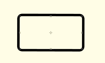
With these settings applied you should have something similar to below:

First Rectangle Done

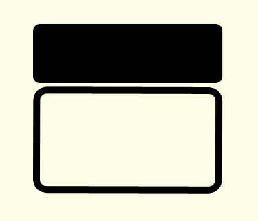
Now we need to draw our second rounded rectangle, this time make sure that the foreground colour is set to black (#000000) and draw a shape the same as below:

Second Rectangle Done

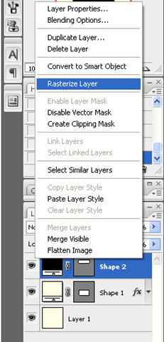
Now right click in the layers panel on the second shape and choose rasterize layer as shown below:

Rasterize Layer

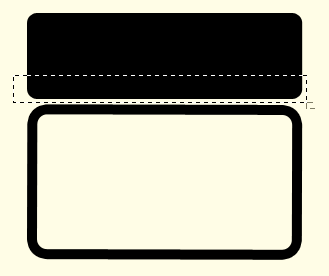
With this done select the Rectangular Marquee Tool (Shown Below) and make a selection the same as what I have done below:

Rectangular Marquee Tool

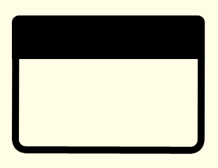
When you have the same selection simply press delete (Note: Make sure that you have the second shape layer selected otherwise it won’t do anything) when this is done you should have a shape with a flat bottom which then needs to be positioned on top of the other shape as shown below:

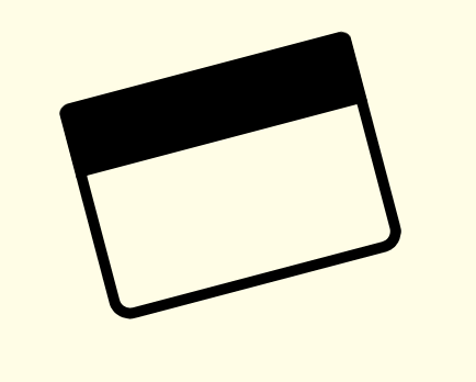
Now to finish off with these two shapes select both of the in the layers tab (CTRL + Click both of the layers) and then choose the Move Tool and rotate the two layers so that you have the outcome below:

Step 3 - Adding The Brushes

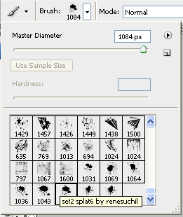
The first brush set we are going to use can be found on Brusheezy but to save you time finding it there is a link to it HERE, once you have downloaded the brushes load them into Photoshop and use the brush shown below:

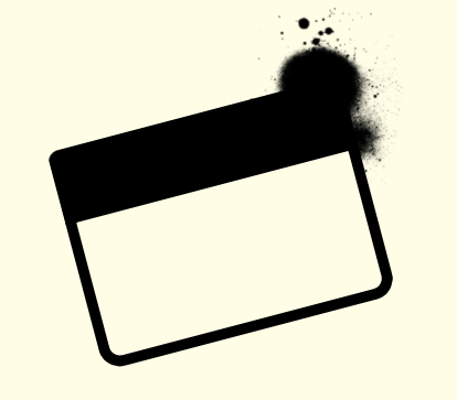
With this brush selected create a New Layer (CTRL + Shift + N) and set black as your foreground colour and then press the ” [ ” key on your keyboard this will make the brush go smaller, I made mine go to 200px and the applied it to the top right hand corner of the rectangles we created earlier:

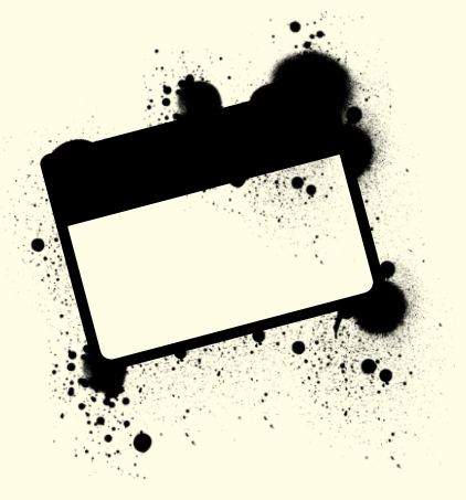
Now you have the basic principle you can play around with the different brushes in the pack and apply them all over the shape, but make sure to create a new layer for each separate brush as this allows you to change them later if needed, when I had finished playing around I had something like below:

Now if you wanted you could change the foreground colour of the brushes and apply some more around the rectangles to make it look more warn like below:

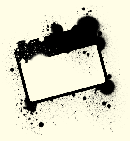
Next we need to add the second set of brushes which can be located and downloaded HERE and then we can start playing around with these brushes, there aren’t a lot in this set so just choose the brushes that you like the best and apply them on your banner, you can use the below image as reference (Note: Make sure the foreground colour is set to black #000000)

As you can see it is just a case of experimenting where you want the brushes to go and where looks good, when you have something you are happy with then we can move onto the final step.

Step 4 - Adding The Text

Now it is just a case of adding some text to the banner I simply added the name of my website like below (Note: I used the Font TW CEN MT Condensed Extra Bold) when the text has been been added simply rotate as before and place inside the of the banner:

Now to finish off you can some more of the splatter brushes over the top of the text which would help make the text look worn and grungy like the rest of the image and when this is done you have the finished product like below, this could be used for posters or websites the list is endless:

And as always if you have any problems with this tutorial then don’t hesitate to leave me a comment or email me at: stevie489@googlemail.com and I will help you as much as I can…

The New Website

by Steve Tolley

WordPress…

As you can probably see the website has changed, as I was promising for quite a while on the old website I was working on a new design, and this is the outcome, so far I havent finished absolutely everything yet as there is still some pages and posts that need to be arranged and added, but I thought I would get most of it uploaded and then finish it from there.

I hope you all like it and any feedback/criticism would be much appreciated, as I need to know of any errors or invalid links/images so if you find any either contact me via the contact form or leave me a comment on this post and I will do my best to fix it.

Also now this is up it means I can start doing some more posts again and upload some more of my tutorials,

There is also a new page on the website called “Your Tutorials” this section is for you to request a tutorial or upload one of your own using the included form (which needs tweaking still) as I am always happy to be helped when writing them as it is difficult to keep on top of this and my studies aswell so any help would be appreciated,

Thanks and happy Photoshopping,
Steve