The ‘Creativity’ Wallpaper

by Steve Tolley

This tutorial is possibly one of my favourites as I love the outcome, we are going to create a desktop wallpaper with a bit of a difference, we will use a range of techniques and most importantly we are going to use our imagination and creativity skills,

What We Are Going To Achieve

Step 1 - New Document

Create a new document that corresponds to the size of your desktop, mine being 1440 x 900, you can check yours by right clicking on your desktop and choosing Properties from the pop up list.

Step 2 - Radial Gradient Background

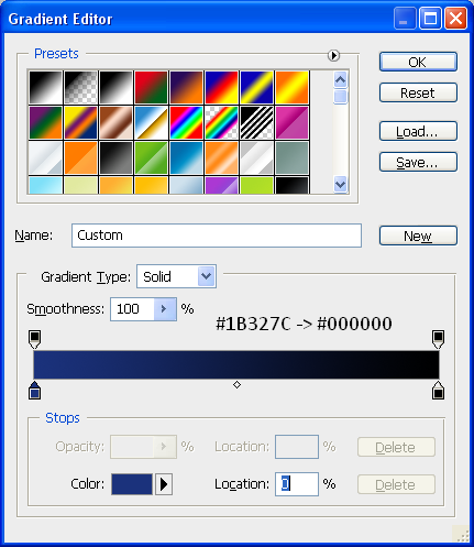
To start we are going to add a radial background to the canvas, to do this pick the gradient tool and make sure it is set to radial gradient (Top toolbar option) and then set your colours to the below:

With the gradient colours set then drag the cursor from the middle of the document to one of the outer corners in order to get a evenly distributed gradient like below:

Step 3 - Write The Text

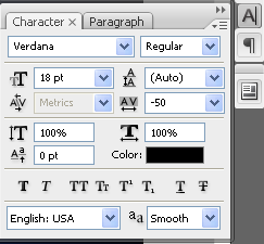
To get the effect so that the “Y” has fallen over you need to write the text seperate, so first of all write the word “Creativit” I have used the font MUSEO which can be found with a quick search in Google and then set the font spacing to “-50″ the font menu can be opened by going to Window > Character on the top toolbar then you can use the settings below:

When you have applied these settings then your text will look like that shown below:

When you have this, then you can write in the Y in a seperate layer, then simply choose the move tool and rotate the Y so that it looks similar to below:

Now that you have the basic layout, you can add some very simple blending options, to do this simply double click the desired text layer and make sure that the drop shadow is ticked and press OK, now do the same for the letter Y and you will have an outcome similar to below:

To add to the effect you can add a simple shadow as shown in the Realistic Shadows tutorial which makes it look as if it is sitting on a floor.

Step 4 - Adding The Spill

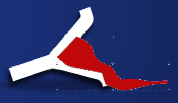
To add the spill make sure your foreground colour is set to a bright colour (I chose RED as that is the colour I wanted the final spill but you can use any colour) and then with the PEN tool selected draw a shape the same as below:

Now move this layer below the letter Y layer in the Layers tab so that it looks as if it is actually spilling out of the letter itself, now we can add the seperate splatters which are simply little shapes drawn with the pen tool, any shape can be drawn and any amount can be drawn it is up to you, also you can use the below image as a reference:

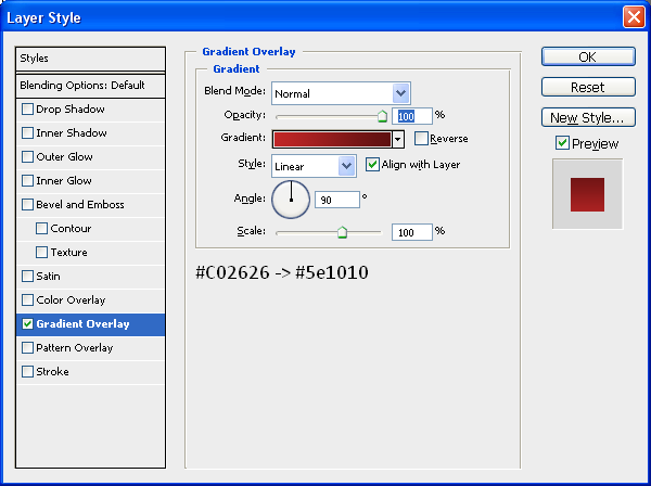
You can also add a gradient to the main spill and the little splatters to get a better effect and add more depth so you can add the Gradient below through the blending options menu:

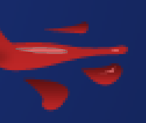
To finish off the spill you can some highlights as shown below, these are made with the pen tool when the foreground colour is set to a lighter version of the original colour used:

When you have applied these highlights then you will have the finished spill like below:

Step 5 - Adding Broken Cables

There must be a reason why the letter “Y” has fallen over and spilt the liquid inside…? Well there is the cables that hold it up have snapped, so in this step we are going to make those cables, first of all grab the pen tool and draw a simple path on the end of the horizontal bar on the letter “T” (shown below) once this has been done create a new layer (CTRL + SHIFT + N) and then right click the path you have just made and choose “Stroke Path” and then press OK this will make the path a line created by your brush, now do the same on the top of the letter “Y” and you will have something similar to below:

Apply a simple Drop Shadow through the Blending Options menu and also make sure the cables are white, so if they are not already white, then add a Colour Overlay also through the Blending Options menu and set the colour to white.

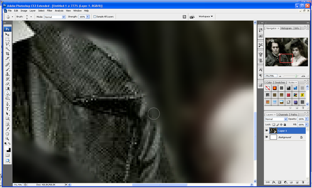
Once the cables are done then we need to make them look as if they are frayed at the ends, so they actually look like they have broken apart, to do this zoom into the end and then choose the Smudge tool from the toolbar (shown below) and simply drag away at the edges so you have something similar to below:

Now do the same to the other part of the cable, once you have done this you will have something similar to below:

Step 6 - Adding The Hat

This step is simple as it is just a case of getting the hat image and inserting it into the document and then positioning it in the right place,

So grab the HAT picture located HERE!

And open it up in Photoshop, when this is done drag it onto your wallpaper document and position on the top left of the letter “C” that is pretty much it as I have already rotated it to the correct angle, but it can be resized/rotated accordingly, when the hat is in place you will have the same as below:

Step 7 - Adding The Liquid In The “V”

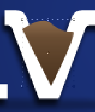
This step is very similar to Step 4 where we adding some liquid/paint to the inside of the letter “V” to do this set your foreground colour to any desired colour that you want and using the Pen Tool again draw a shape like below:

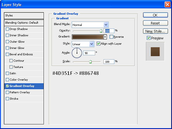
Now drag this layer below your text layer in the layers tab so it looks as though it is inside the letter, and then double click the layer and apply the below gradient (Change the colours if you want to):

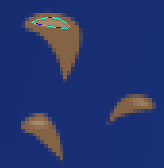
With this gradient applied create some liquid drops so it looks as though something has just fallen in it and splashed it everywhere, use the below image as a reference, once done apply the same gradient to all of these drops:

Now you can add the highlights again using the same methods as in Step 4, grab the pen tool and make a shape but make sure the foreground colour is set to a slightly lighter colour than what is on the drop itself, when this is done you will have something similar to below:

When this is done we will have something similar to below and will be left with one final step:

Step 8 - Adding A Slogan/Motto

To finish we are going to add a simple slogan/motto to the bottom right of the word “Creativity” so make sure your foreground colour is set to white and type the text “It’s Amazing What You Can Do…” or something similar and then open up the blending options menu and add a simple drop shadow you are then left with the below:

With this done we are finished, feel free to add more things to it, and experiment with different shapes and words and see what you come up with, if you create something then why not upload it to the “Photoshop Tutorials Flickr Group” so others can see what you have achieved

So now we are finished you should have something that looks like the below:

And as always if you have any problems with this tutorial then don’t hesitate to leave me a comment or email me at: stevie489@googlemail.com and I will help you as much as I can…

Using The Pen Tool - The Basics

by Steve Tolley

This tutorial is more for the beginners of Photoshop on how to use the pen tool and what you can do with it, although some more advanced with Photoshop may also find this useful, it is just a quick tutorial today as I am currently working on a new WordPress layout for this website so I am quite occupied with that, but I will still be doing tutorials every other day whilst I am doing this.

Step 1 - Find Image

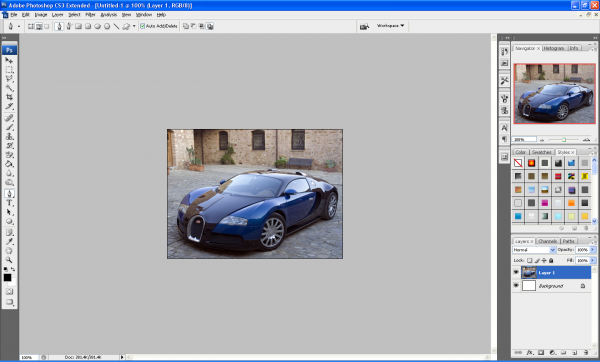
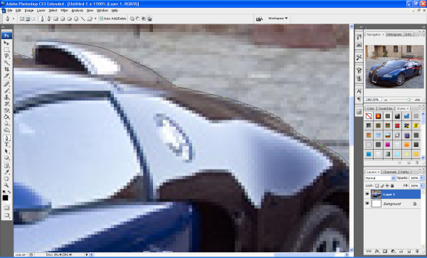
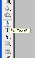
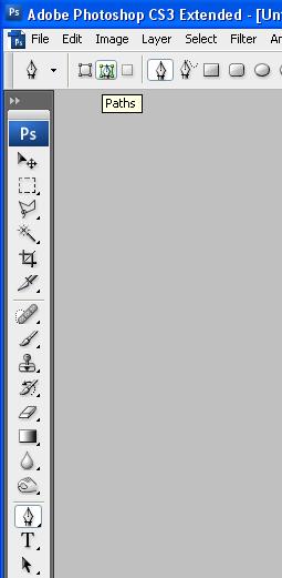
First of all find the image that you want to use in this tutorial; I have used a picture of a Buggati Veyron and open it up in Photoshop, now choose the pen tool on the left toolbar (as shown below) but before we use it I am going to explain what it does and the benefits of using it:

Original Image:

Pen Tool

The pen tool allows you to make “paths” which can be used to cut out certain parts of images or so that you can make a range of different shapes.

Advantages of Using the Pen Tool

The pen tool offers more flexibility over other tools (e.g. Polygonal Lasso Tool) because the pen tool not only creates anchor points but when you have clicked where you want the anchor point to be, if you hold down the button and drag you can create a curved shape which can be used to draw around curved objects.

Step 1 (Continued…): Now back to step 1, with the pen tool selected at the top of the window you will see the below toolbar which shows the settings of the pen which can be used, if you hover over each setting it will explain what they do, for now use the settings below and you can experiment whenever you want to:

Step 2 - Using The Pen Tool

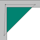
Now zoom into your image and click on the canvas around the edge of your chosen object, this is the starting point of your selection now when you click at the next point in your object notice that it makes another small square (You might notice you can’t click on the adjustment bar ends. That is, until you hold the CTRL key. When you hold the CTRL key, your cursor will change to a solid white arrow, the Direct Selection Tool. Now you can click on the adjustment bar ends and adjust the curve of your selection. Now try holding the ALT key. You should get a two-sided arrow when you mouse over your adjustment ends, the Convert Point Tool. Click and drag to adjust only one aspect of your curve. This is how you make sharp edges with your Pen Path.) Now keep clicking around the edge of your chosen object and remember if you want a curved line, click and hold and then drag in the direction of the curve.

Step 3 - Connect The Two End Points

When you get the hang of it, it is really easy to use, once you have gone around the whole outer edge of your object join the starting point and ending point together, you will now have a “Path”

Step 4 - Make Selection

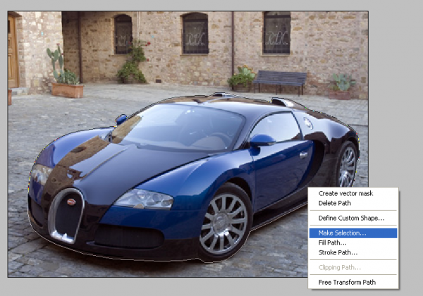
Now right click in the path and choose “Make Selection” as shown below,

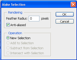
Step 5 - Make Selection Menu

This will bring up a menu showing some different settings, but leave this as default as they don’t need to be changed.

Step 6 - Drag And Drop Image Onto New Background

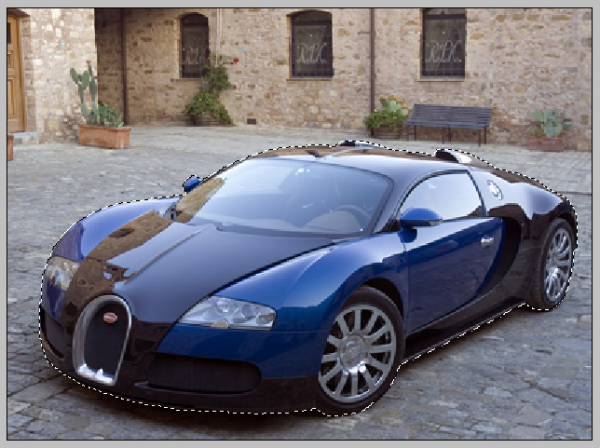
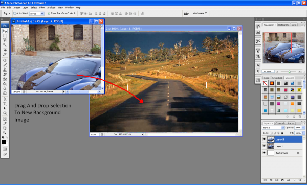
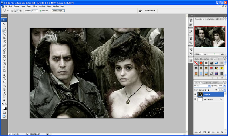
With your path now selected you will see the crawling ants around the edge of your image, now when you choose the move tool you can see that your selection can be moved around etc…Now open up a new background in a new document and simply drag and drop your selection into it as shown below:

Crawling Ants:

Drag And Drop:

Step 7 - Play Around With The Final Image

You can now play around with different shadows and options to get just the right look and once I had done this I had something that looked similar to below:
(This final image does look rubbish but that was not the point of this tutorial, the point was to show you that there are other ways to extract an image rather than using the eraser or magic wand tool, if I had more time i would have made this final image look better, but it will do to illustrate my point)

Finished:

This tutorial was just the basics of using the Pen Tool but there are lots of other different things which it can be used for, so go and play around with it and see what you can create.

If you have any problems with this tutorial then don’t hesitate to leave me a comment or email me at: stevie489@googlemail.com and I will help you as much as I can.

Depth of Field Effect

by Steve Tolley

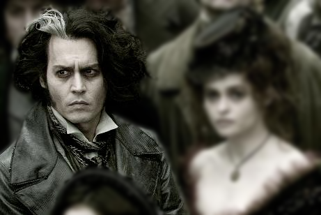
This tutorial shows you how to make a “Depth of Field Effect” in Photoshop this is where you pick something in an image that you want to “Stand Out” and then blur the background so the focal point of the image changes, really cool effect and can be used on any image.

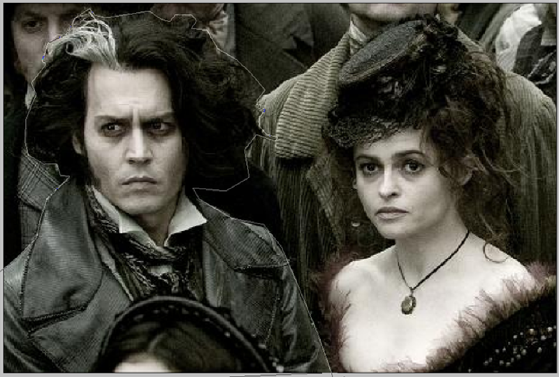
Step 1: First of all get the picture that you want to edit and find the thing on the image that you want to make “Stand Out” when you have done this choose the Pen Tool and draw around the outline of the chosen object that you want to stand out as shown below:

Step 2: When this is done make sure the two ends of the path are connected and you should have the line of “crawling ants” around the selection, if like me there is something in front of your selection that you do not want to include in it then simply hold ALT and draw around the outline of that to subtract it from the selection as below:

Step 3: When this is done you have your selection ready, now press CTRL + Shift + I which inverts the selection to select everything outside of the original selection, now go to Filter > Blur > Gaussian Blur and set the blur to around 3 pixels (depends on image so adjust it so that it looks ok with your image) and press ok.

Step 4: Now we are nearly done, to finish simply choose the blur tool (raindrop shaped) and pick a decent brush size and go around the very edge of your selection so that the edges don’t seem to sharp or pointy

And there you go the simple way to make something stand out more from their background below is the comparison from the original image to the finished image:

Finished Image:

Original:

Making Text Follow A Path

by Steve Tolley


A very simple 3 step method to make normal Text follow a drawn path, can be used in many situations with good results.

Step 1: First open up a new document (any size you want) and simply choose the pen tool and draw the desired path by clicking the start point and then clicking again where you want the line to bend (to bend click and drag in any direction to the desired size) do this until you are happy with the shape of the line.

Step 2: Now simply choose the Text tool and move the cursor to the start of your line and when the cursor looks like the one shown below click and then start typing, if done right the text should follow the line/path you have drawn.

And there you have it, Text that follows a Path:

Step 3: Now apply this method to any image to get a good effect that really stands out:

If you have had any problems with this tutorial and would like some help then don’t hesitate to contact me either by leaving a comment below or e-mailing me at: stevie489@googlemail.com