Making a Compact Disc Icon
This tutorial will show you the steps and techniques used when creating a CD icon which can be used on websites etc… Very useful as the same techniques can be applied when making other icons/images
What We Are Going To Achieve

As you can see it looks realistic and it is also vector style so can be scaled easily
Step 1 - Create A New Document
The best thing to do when making an icon is to make a large canvas when designing it as this helps add detail and allows for the image to be scaled later without the worry of pixelating it, bearing this in mind I started out with a canvas of 500×500 so therefore I can scale it down later.
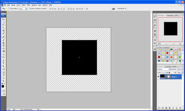
Step 2 - Creating The Basic Shapes
The first thing you need to do is create the basic shapes for the CD and then we will add the stylings later
The first shape is a simple circle in the middle of the Canvas, to start with give it a neutral colour and then we can also change this later use the image below as reference:
First Shape:

The next shapes are also simple circles so just use the images below as reference on where to put them and what sizes they all need to be:
Second Shape:

Third Shape:

Fourth Shape:

The next few shapes are different to make as they involve using the perspective tool and rectangles:
First of all grab the rectangle tool and draw a rectangle like below:

Next press CTRL + T on your keyboard to enter transformation mode, this then allows you to play around with the shape, simply right click on one of the anchors and choose “Perspective”

When you are in perspective mode then click on one of the right hand side anchor points and drag either up or down (depending on which anchor point you chose) the idea is to make one side larger than the other:

Now you need to move this rectangle to the desired position, to do this simply rotate the rectangle and place in the position you want, also if needed resize and change perspective:

Now we need to make it fit to the outer shape to do this right click the rectangle layer in the layers tab and choose rasterize layer which allows the shape to be edited further, with this done CTRL and CLICK on the preview image of the Fourth Shape in the layers tab, like below:

This will give you the crawling ants around the biggest circle which indicated that it is selected, now press CTRL + SHIFT + I to invert the selection and make sure that the rectangle layer is selected in the layers panel and then press delete to get rid of the excess part of the rectangle to leave you with something like below:

Now press CTRL + J to duplicate it then simply rotate it and place it on the other side of the circle so that you have something like below:

Using the same principles as the above 2 rectangles we need to make 4 more, but they dont need to have the perspective added to them, so repeat the last few steps without the perspective steps so that you have something like this:

Step 3 - Adding The Blending Options
Now that we have the basic shapes in place we can start to add the blending options and effects which will then start to give this CD some life,
We will start with the first circle shape and work up from there, on this we need to set the colour to white and add a drop inner shadow using the settings below (to access the blending options menu simply double click the desired layer in the layers tab) :
Color Overlay:

Inner Shadow:

When these blending options have been applied your first shape will look something like this:

Now to move onto the second shape, on this shape we need to add a colour overlay again using the colour #CFCFCF and the add a stroke which is just plain white (#FFFFFF) and has a size of 3px:

When the color and stroke have been applied you will have something like below:

Now for the third shape we need to add a simple drop shadow, this effect is faint but will add to the final effect:

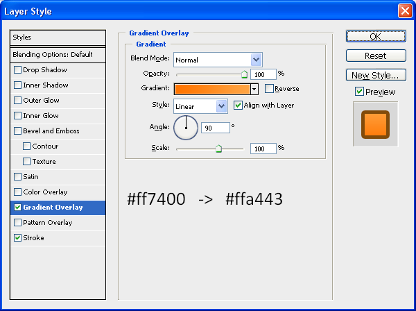
For the biggest circle we need to add the main gradient and a white stroke, for the gradient use the settings below:

And for the stroke you need the settings below:

When these settings have been applied then all of the main basic shapes are done, and you will have something like the image shown below:

Step 4 - Adding Details
To give the overall CD shape a border the best thing to do is to duplicate the biggest circle shape and add a larger stroke to it, this will show the CD to have a grey coloured border, to duplicate just press CTRL + J when the fourth shape (biggest circle) is selected in the layers tab and it will create another exactly the same, then go into the blending options and add a stroke with a size of 6px and colour #B7B7B7, this will give you the image below:

To finish off this CD we need to add some colour to the extra rectangles that we have created, using the image below as a colour reference simply add a colour overlay to each of them with the colours specified, or a gradient overlay if there are 2 colours shown:

And there you go we are finished! once you have all of the colours and gradients added then you will have a finished CD icon which can be used for many different things, below is the fullsize finished image.
It would be cool to see what you come up with so feel free to upload them to the Photoshop Tutorials Flickr Group and leave me a comment to say when you have uploaded one so people can comment on them,
And as always if you have any problems with this tutorial then don’t hesitate to leave me a comment or email me at: stevie489@googlemail.com and I will help you as much as I can…
Also if you want, this CD will be in an icon pack that I will be releasing soon just leave me a comment and if I get enough people wanting the pack then I will release it when it is completed and I once I have done some more icons.


