Making a Sign/Banner Using Light and Shadow
This tutorial has proven to be very popular as it shows how to make a sign/banner for a business or website using a variety of blending options to show light and shadow, which leaves you with a great effect at the end which would really stand out on any website/image.
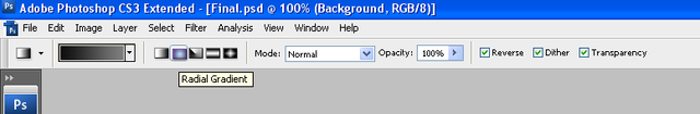
Step 1: First of all create a new document sized 600 x 600, then choose the gradient tool and set the colours to: #000000, #49454d, and make sure that it is a “Radial Gradient” drag the gradient from top left to bottom right so that the lighter of the colours is in the top left.
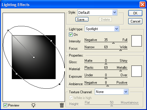
Step2: Now go to Filter > Render > Lighting Effects and use the settings as shown below, this will create the illusion that a light is shining from the top left corner,
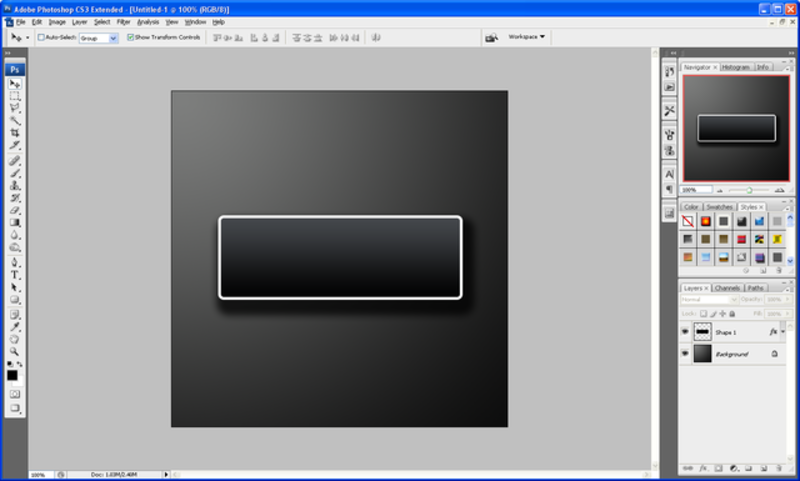
Step 3: Now choose the “Rounded Rectangle Tool” on the left hand toolbar or simply press “U” on the keyboard, and draw yourself a fairly large rectangle but make sure that the primary colour is set to black.
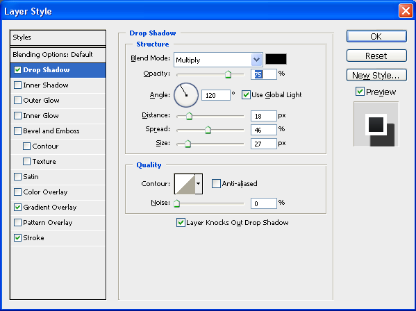
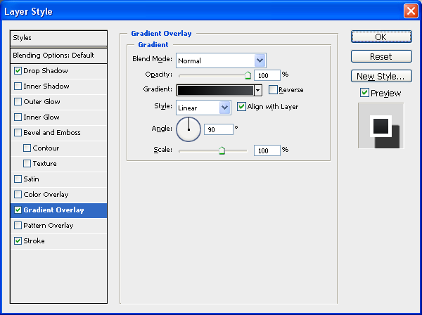
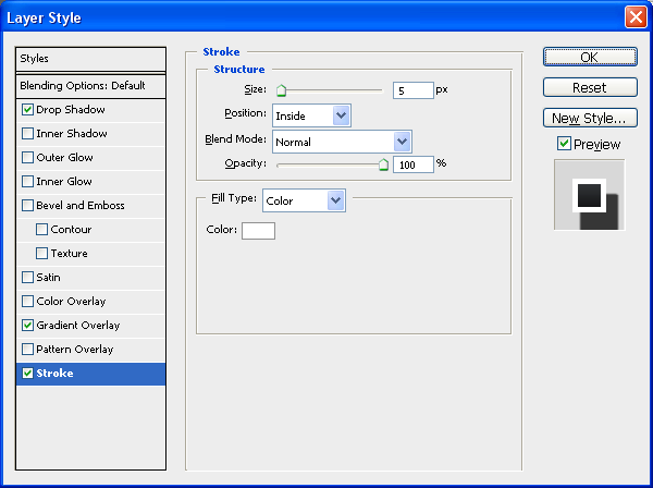
Step 4: When done right click on the layer in the layer tab and choose blending options and then choose the options and settings as shown below, when done click “OK”
Step 5: Now that you have set the blending options to the above settings you should be left with something as shown below:
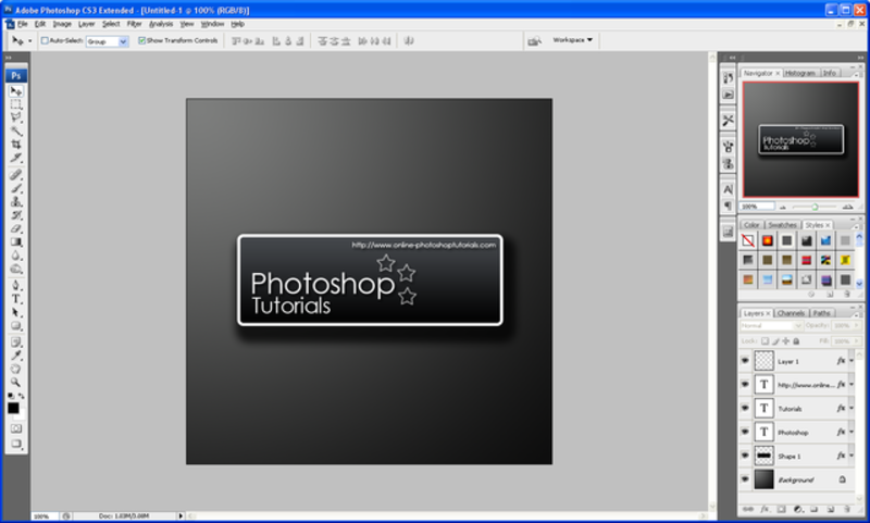
Step 6: Now we can start to add text and different effects I am going to use my own text which you can also use but feel free to use your own text and effects, after entering my text I simply added a default drop shadow in the blending options menu just to show light and shadow effects:
Step 7: When you are happy with what you have created then simply hold SHIFT and click the first layer and the last layer on the layers window which should select all layers (except background) and choose the Move tool and rotate to an angle that suits you best:
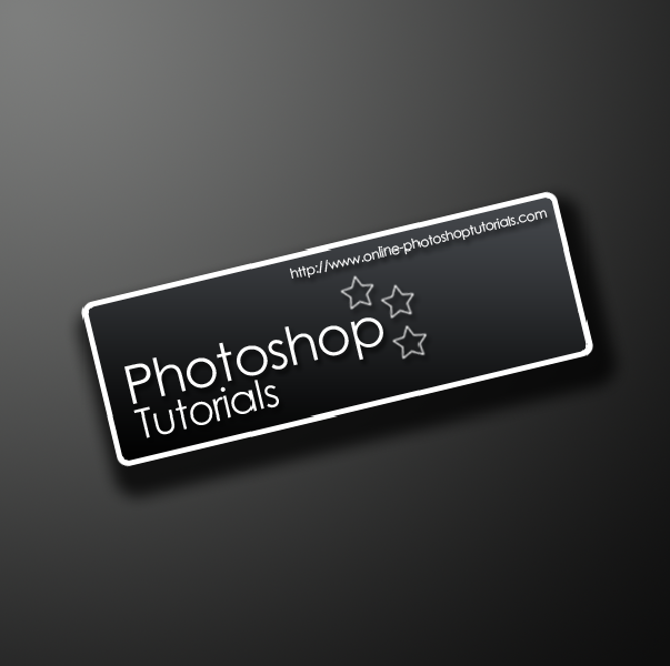
Step 8: To finish you can download this “Urban” Set of brushes and create a new layer above the background layer and add the one that you think looks best and set the opacity to 5% to give your design a better feel and a bit more depth
Final Image:
I also added one of the Urban brushes to the rectangle shape on a new layer below the text layers; this was to give it a better look and to show some texture instead of flat colour.

Also if you have any problems with this tutorial or need any help Photoshop then feel free to leave a comment or e-mail me.


Pretty sweet. I like it.
Very nice Tutorials
i did some more stuff to it and i got this:
http://img383.imageshack.us/my.php?image=piczp3.jpg
Awesome!!
Can I get the PSD please?
mail it to me @
seiferc[at]gmail[dot]com
Thanks
@ Auro:
Very nice mate, i like the fire/lava style effect in the rectangle very effective, keep it up.
@ Seifer:
Yes sure thing mate the PSD is on it’s way =D
could you send me the PSD pleease!!??
eskimophil@hotmail.co.uk
good job mate
Hey, I sent you an email asking for the PSD. Thats very cool man. My email is dimitris13@hotmail.co.uk
Seifer, ur design is very good can i get the banner plss?thanks..u rox man
xmiccyx@gmail.com
yeh would love a copy of the PSD too please.
IrishiPhone@gmail.com
Cheers
Can i get the PSD also.
My email is AsusAmd@gmail.com
Hi!
I need the PSD file, please.
Thank you.
matwb@live.se
Very sweet tutorial =)
This is what I got;
http://img228.imageshack.us/img228/3734/kanon081518gp0.png
/ Alex
Very nice Alex, I like the added brushes that you used they make it stand out nicely, keep it up!
Steve =D
Can you send me this PSD plz
mail: ssocce@gmail.com
Very nice work.
I will do that tutorial…
My result:
http://i149.photobucket.com/albums/s51/Drengebarnet/amalieertyk.png
I doesn’t look really great, but it’s somethying
I tried to follow the tutorial, but I ran into a couple of problems. First, I couldn’t get the lighting effect to look anything like what yu have. It’s either a bright white spot in the corner, or way too dark. Second, I couldn’t figure out how to select the layers. I clicked on the layer with the rectangle, held shift and clicked the top layer, but nothing happened. I was able to link them all, but when I went to rotate them, it only rotated the bottom layer. If anyone could possibly help me I’d appreciatae it
Also, if you still give out the PSD, or if someone else who he already sent it to, could possibly send me a copy that’d be great.
Email: tmcvale@aol.com
Thanks again,
Tim
I really like the tut/result. great techniques! please email psd to tr1ogy217@gmail.com … thx
It’s great tutorial and great effect! Could you send me .psd file?
Ohhh, my e-mail: skawit@tlen.pl
Thank you!
Auro said…
Very nice Tutorials
i did some more stuff to it and i got this:
http://img383.imageshack.us/my.php?image=piczp3.jpg
06 April 2008 11:26
How did you do the fire/lava style effect? Can I get the PSD please?
thrjug@mail.com
Auro How did you get the fire/lava style effect? can you send me the psd please thrjug@gmail.com
hi i want psd file
thanx
band_bros47@yahoo.com
Very good tutorials
The PSD has now been added as a download just below the final image…Enjoy
how can i download this site to my pc?
this post is fantastic
Oh thats beautiful!
Cool site goodluck
Jonny was here
Great tutorial thanks. Here is drop shadow generator: http://www.dropshadowz.net
I can’t download it!:(
Can U send me this psd plz?
palinka@dravanet.hu
Thanks you!
Hi, I left a comment about 8 months ago…just curious as to which of the urban brushes you chose for your “rectangular splatter” layer.
I have found the tutorial extremely usefull and have downloaded the urban brushes file but how can i use it in the photoshop and update these brushes
hey everybody//
I Need your help of wallpaper for a project
i doing in school it’s about chocolate
anyone can help me plz sedn me the photo to my e-mail
pinkk-skull@hotmial.com
thanks..i like!
I have small dote about lighting and shadow in collage work