This tutorial will show you how to create a firey text style using very simple techniques took me around 10 minutes to complete.
Step 1: First of all open up a new Photoshop document with the sizes: 600 width and 600 height as shown below:
Step 2: Next fill the background Black using the fill tool (Paint bucket)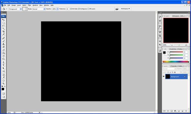
Step 3: Now we need to add the text I am going to use the text “Photoshop” but you can use whatever text you want to.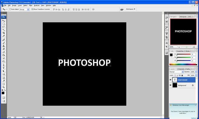
Step 4: Now you need to duplicate the layer with the text on it (Ctrl + J) when this is done we need to hide the copied layer as we do not need it at the minute to do this click the "eye" next to the layer which will hide it for now.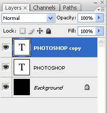
Step 5: Now rasterize the original text layer to do this right click the layer and click on "rasterize type" this will change it to pixels instead of text.
Step 6: Next select both the background layer and the original text layer and right click and press "Merge visible" as shown below: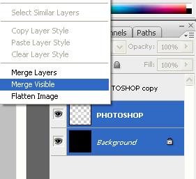
Step 7: Now we need to rotate the canvas in order to successfully the next filter, to do this click, Image > Rotate Canvas > 90 CW and this should rotate the canvas to the right.
Step 8: Now we need to add the wind effect to do this click Filter > Stylize > Wind when the menu pops up choose from the left and press ok, when it applies it press Ctrl + F twice this will repeat the process twice and give you bigger flames: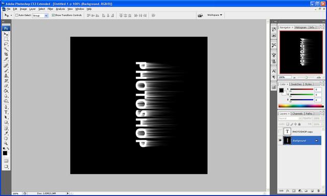
Step 8: When the wind has been applied then rotate the canvas back to normal to do this simply go to Image > Rotate Canvas > 90 CWW which should rotate it back to the original way:
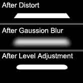
Step 9: Next we need to add a gaussian blur to do this go to Filter > Blur > Gaussian Blur and set it to blur 2 pixels which should be ideal for the amount we need: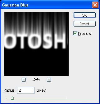
Step 10: Now go to Image > Adjustments > Hue/Saturation this will change the colour of the flames so they look firey, set it to the settings as shown below (make sure colorize is ticked) and then press ok: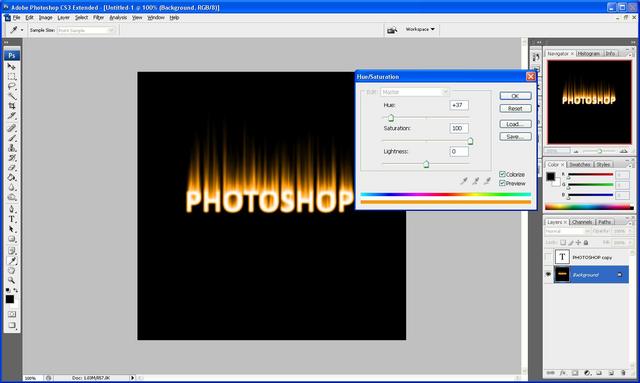
Step 11: Now duplicate this layer again by pressing Ctrl + J and then set it to Color Dodge as shown below and then right click on the new layer and click "merge down":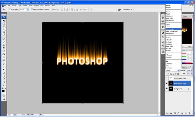
Step 12: Now with the original layer still chosen go Filter > Liquify here is where we make the flames of the fire, simply set the brush size to whatever you want and make the flames by clicking and dragging slightly left to right all the way up on each flame so that you get the result you want, this is where you can customize the size of the flames you want, as mine is shown below: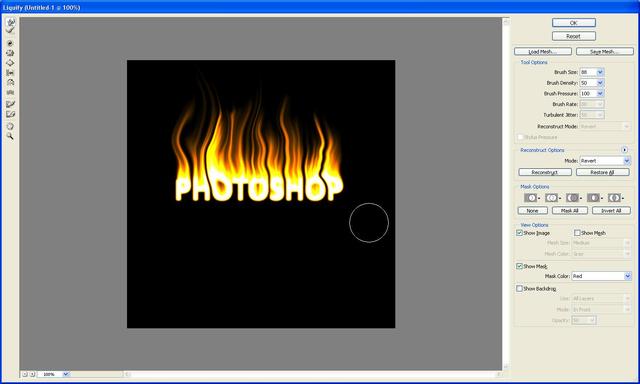
Step 13: Now unhide the copied text layer from earlier and right click and choose "blending options" this will open up a box and when this opens use the settings as shown below, when done click ok: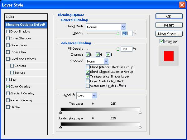

Step 14: And there you go a completed firey text effect: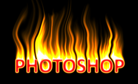
If you had any problems with this tutorial then please dont hesitate to contact me by either leaving me a comment or send me an email to stevie489@googlemail.com
Type Query Here

Tuesday, 4 March 2008
Creating "Firey" Text In Photoshop


Sunday, 2 March 2008
Creating 3D Text in Photoshop
This tutorial is a simple but effective way to create 3D text using only Photoshop. Easy to follow tutorial with alot of detail, outcome is good and cathces the eye well!
Step 1: First of all open up a new Photoshop document with the sizes: 600 width and 600 height as shown below:
Step 2: Next fill the background Black using the fill tool (Paint bucket)
Step 3: Now we need to add the text I am going to use the text “Photoshop” but you can use whatever text you want to.
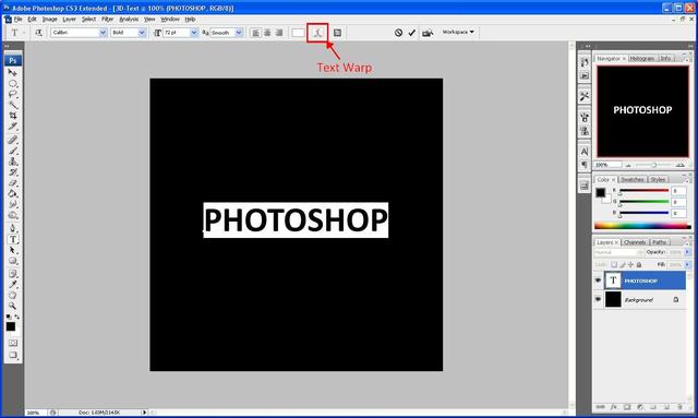
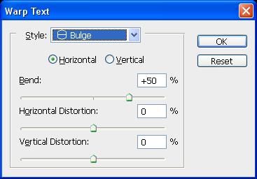
Step 4: Next we need to “Bulge” the text using the “Text Warp” tool as highlighted below:
Step 5: We then select bulge from the menu that appears and use the below settings:
And we should get the result as shown below:
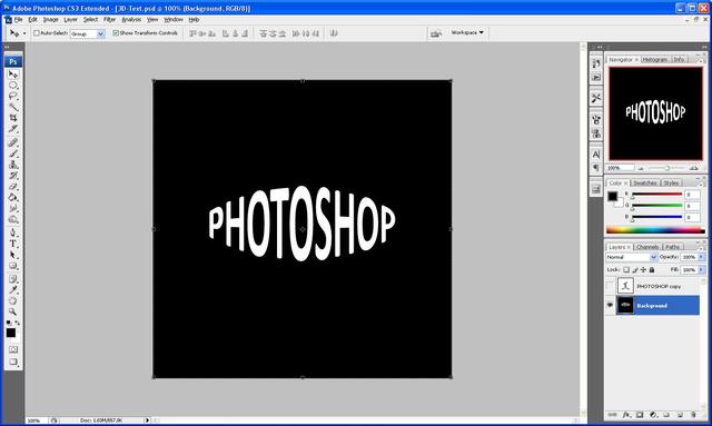
Step 6: Next we need to duplicate the text layer so that we have two layers of text, but we need to hide the copied layer because we do not need to use that at the moment (so click the “eye” next to the layer which will hide it) now we need to group the visible layers so that the original text layer and the background layer are on one layer, to do this you need to go to Layer > Merge Visible alternatively you can press “Ctrl+Shift+E” which will do the same job. So that you are left with something that looks like the image below:
Step 7: With the Original layer (Background layer) selected go to Filter > Distort > Polar Coordinates and use the settings below:
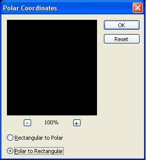
Then click OK which will give you something that looks like the below image:
Step 8: Now go to Image > Rotate Canvas > 90 CW this will then rotate the canvas, then you need to go to Filter > Stylize > Wind and use the settings as shown in the below image:
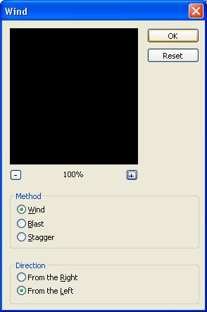
After you press ok press Ctrl+F ten times which will repeat the wind filter ten times to give you something which looks like this:
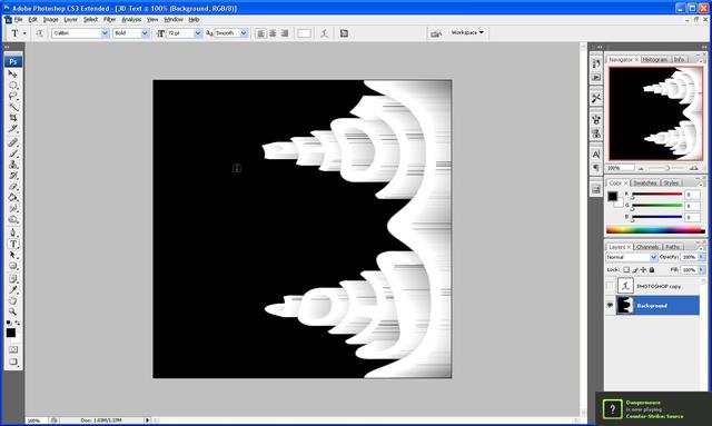
Step 9: Now you need to rotate the canvas back to how it was before so go to Image > Rotate Canvas > 90 CCW which will give make the canvas rotate to its original position and now we need to reverse the Polar Coordinates so that it is how it was, so go to Filter > Distort > Polar Coordinates and choose Rectangular To Polar which will reverse the one that you did before, and you should end up with something like the below image (if not then check back to make sure that you have done everything ok up to now)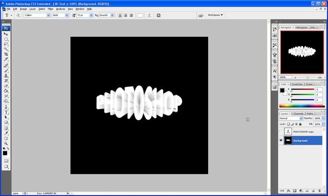
Step 10: Now comes the stage where we need to unhide the copied text layer so click where the eye was and it should reappear (but if you did the text in white you won’t be able to see it, so just change the colour of the text by highlighting it and changing the colour) and you should now see it like below: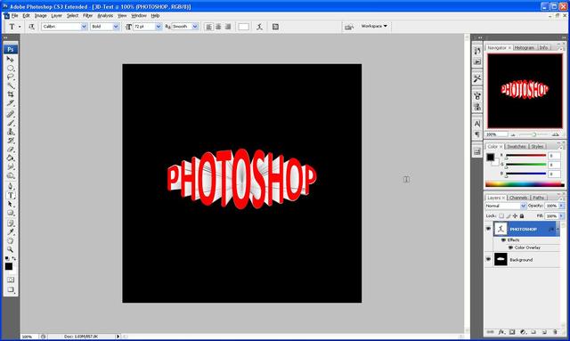
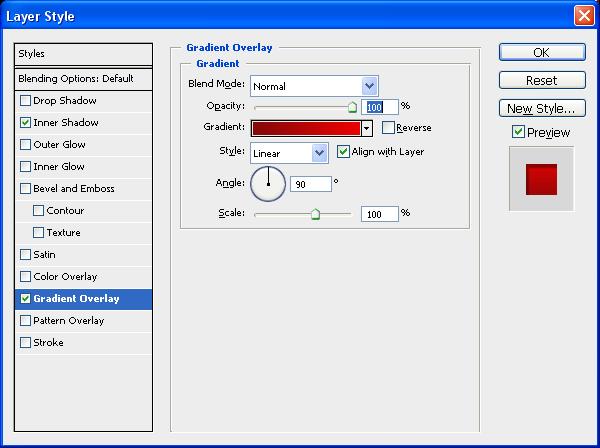
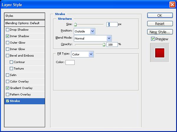
Step 11: Now all we need to do to finish is add a few “Blending Options” to access them either double click on the layer itself or go to Layer > Layer Style > Blending Options once the window opens up use the below setting as shown and you should get the final outcome (I chose red but you can use any colour that you want to)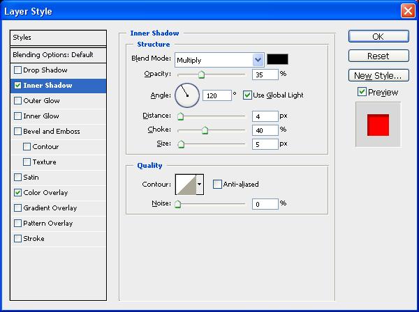
If you do all of this correctly then you should get something that looks like the image below:
Thank you for reading and I hope that this tutorial has helped you, if you have any problems with this then don’t hesitate to contact me, either leave a comment or send me an email to stevie489@googlemail.com and I will respond ASAP.
Thursday, 21 June 2007
Creating The Google Blogger Icon In Web 2.0 Style
This tutorial shows how to simply create the Google Blogger icon in Web 2.0 style using Photoshop, easy to follow and understand and can be used on any image/icon.
Step 1: First of all get the picture of the Blogger Icon (Can Be Found HERE) and copy and paste it into a new document (size: 500 width and 700 height) click and hold on the eraser tool and choose magic eraser and click at the bottom right and left corners to get rid of the white border around the image (if this is not done then the blending options will not work)
Step 2: Next we have to add a couple of "blending options" (right click on the layer and choose "blending options") we are going to add an inner glow (colour white and size 20) and a bevel (size 200 and shadow opacity 30%) these are both shown below...
Step 3: After completing the above we need to add the highlights, to do this we need to create two new layers and right click on these and choose clipping mask (an arrow will appear next to the blank layer pointing to the blogger icon layer) now with the first clipping layer chosen, choose the elliptical marquee tool and put an oval around the top of your icon, and then fill this with white and change the fill percentage to 30 and you will be left with the below image...
Step 4: Now do the same with the second blank layer but do this at the bottom of the blogger icon and fill with black and change the fill percentage to 10 which will leave you with the below image...
Step 5: Now choose both of the new layers (clipping masks) and rotate to the left so that they are at an angle on the blogger icon as shown below...
Step 6: Now choose all of the layers (except for the background layer) and right click and choose "merge layers" this will put all of the layers into just 1
Step 7: Press CTRL + J (this copies the slected layer and pastes it into a new layer) and the choose EDIT > TRANSFORM > FLIP VERTICAL and then move the copied layer directly below the original layer and if needed select both layers and minimize slightly
Step 8: Finally add a layer mask to the flipped layer and choose the gradient tool (make sure the black and white option is chosen) and drag from the bottom upwards so that half of the image is white and if needed change the opacity this will leave you with the final image as shown below...
This can be done with any image using the same settings..
If there is any problems with this tutorial or you get stuck then leave a comment and I will respond to it ASAP.
Thursday, 7 June 2007
Creating A Very Simple Desktop Wallpaper
This tutorial is a very quick and simple guide on how to create your own desktop background, it's easy to follow and understand and the outcome looks quite good for the simplicity of the design,
Creating Your Own Desktop Wallpaper
Click any image to enlarge...
1. Open up Photoshop and create a new document name it what you want and set the size to your screen resolution (can be found in the control panel under the "Display" section) have the colours set to RGB and press "OK"
2. First fill the background (using the fill tool) with a pure black colour (#000000)
3. Next go to Filters > Render > Lighting Effects and use the settings as shown below:
4. Next add your text and any blending options e.g. drop shadow etc... and place where you want it,
5. Finally save it as a JPEG and go to the folder where it was saved and right click and choose "set as desktop background" and admire your work
I also made this other background below using similar techniques but instead of using "Lighting Effects" I used "Lens Flare"
Thursday, 24 May 2007
How To Make An Aqua Button
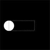
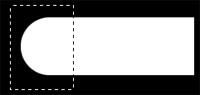
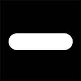
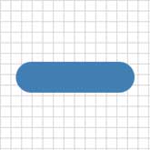
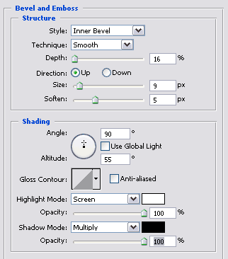
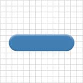
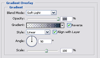
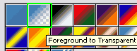
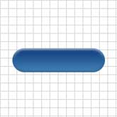
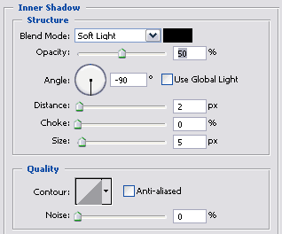
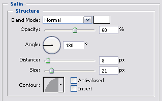
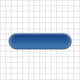
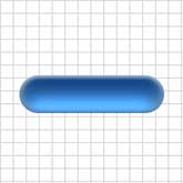
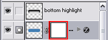
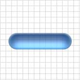
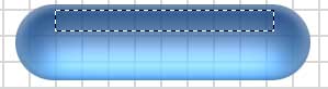
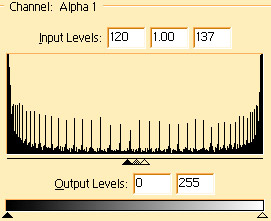
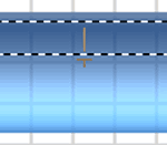
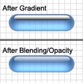
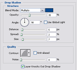
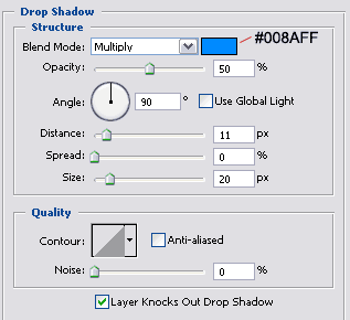
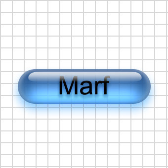
This tutorial is "How To Make An Aqua Button", 1. Create a new 340x340 pixel document and name it Aqua Button. Now make a pattern of your choice and make it the background. Then show channels, and create a new channel. 2. Next in the new 'alpha 1' channel, select the elliptical marquee tool, and make a circle with 70 x 70 pixel dimensions. This will be the rounded edges of your button. Next select the rectangular marquee tool. You will want to start the selection right near the top middle part of the circle, and then drag it out to the right until the height is 70 pixels as well. If it's not completely aligned with the circle after your done selecting, then use the arrow keys to adjust then fill, the selection with white. See image to the right. 3. Now you will have something like a rectangle, but one end is a half circle. Now make a selection of the half circle and some of the rectangle, like this: Now you want to flip the selection horizontally, then click and drag the selection to the right so it matches up. If you are having trouble matching the edges up, Try holding down shift, it locks the image to the x, y and x+y axis while dragging. Then you want to align the image to the vertical and horizontal centers. 4. Now you want to load the selection from the alpha channel. Then show layers, and create a new layer and name it 'button back'. Show colors, and use the color [R: 66, G: 127, B: 180]. Then fill the selection. Now my pill is about 270 width by about 70 height. Now remember that if you are doing a smaller size, you might get a wierd outcome. Best idea is to make it the same size as mine, and shrink it later. Now deselect. 5. Now in the next few steps we are going to apply many layer blending options to the button back layer. First off we will apply bevel and emboss with these settings 6. Press D, to reset foreground color to black. Now apply a gradient overlay with these settings In the Gradient box, Select the Foreground to Transparent (Second Option). Note that the box may not be black, but select it anyways. 7. Now the last two styles you can add. The first one is an inner shadow with these settings Then finally do satin with these settings 8. Now load the selection from the 'button back' layer and contract the selection by 10 pixels. Then contract the selection by 6 pixels. Then feather the selection by 7 pixels. Now you are going to Layer > New Layer.., and a window should pop up. You want this window to popup, that's why we create a new layer by going through the menu. Now in this new window, name it 'bottom highlight' make the Mode: Color Dodge, and then check the box 'Fill with Color-Dodge-neutral color (black). Now press ok, then Press D then X to reset the foreground and background colors. Now fill the selection with white. Then change the fill percentage to about 40%. Then hold shift and press the down arrow twice. Then load the selection from the 'button back' layer again, and inverse the selection, then press delete. Now deselect. 9. Next, create a layer mask on the 'button back' layer. Now load the selection from the 'button back' layer, and contract the selection by 10 pixels, then contract it by 6 pixels, then feather it by 7 pixels. Now click on the layer mask. and fill the selection with 45% Gray [R: 161, G: 161, B:161]. Then deselect, and gaussion blur the layer mask about 18 points. 10. Next, select the rectangular marquee tool, and create a selection like this: which is 200 pixels wide and 20 pixels tall. Then show channels and create a new channel. Now fill the selection (with white). Deselect, then distort the white area like this, and hold down Ctrl + Alt + Shift for the effect to be equal on both sides. Now apply a gaussion blur with settings [Radius: 10 pixels]. Now you will want to adjust levels with these settings 11. Now load the selection from that alpha channel and show layers. Make a new layer, name it 'upper highlight'. Press D to reset the foreground and background colors, then select the gradient tool. Now select the linear gradient, and drag from the bottom of the selection to the top, like so. Then change the 'upper highlight' layers blending mode to 'Screen' and the opacity to 75%. 12. Finally, click on the horizontal type tool and then click in the button where you want text. Type in your text, and make sure your foreground color is black. Then you want to drag the type layer inbetween the 'upper hightlight' layer and the 'bottom highlight' layer. Now apply a drop shadow with these settings: Almost done! Select the 'button back' layer and apply a drop shadow with these settings There you have a cool looking aqua/glass button or pill.
It is a very good tutorial and explains fully what to do,
I have tried and tested it and it works fine for me, any problems let me know and I will do my best to help you.
 .
. 