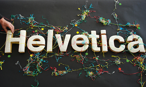
Helvetica - Why is it SO Popular?
The other day I was thinking about what font to use for a some Photoshop work I was doing, and whilst searching through the many different fonts I had, the one that jumped out at me was Helvetica I don’t quite know what it was about the font that stood out so much to me, was it the simplicity, the beauty or something else, this got me thinking and so I did some research…
First let’s look at some of Helvetica’s history,
Who Developed It?
Helvetica was developed in 1957 by Max Miedinger with Eduard Hoffmann in Münchenstein, Switzerland.
The font was originally called Neue Haas Grotesk based on a typeface called Schelter-Grotesk, the main aim of Helvetica as a typeface was to create something that was quite neutral and could be used on a wide variety of signage.
The Name was changed to Helvetica in 1960 which was derived from Confoederatio Helvetica which is the Latin name for Switzerland, this was an idea to make it more marketable internationally.
Variations

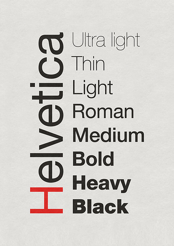
Neue Helvetica is a re-working of the original font done in 1983, this style of Helvetica offered more structurally unified set of heights and widths, this was developed at D. Stempel AG which was the daughter company of Linotype, there are also other redesigns which include improved legibility, heavier punctuation marks and increased spacing in numbers.
Where Is It Being Used?
To put it simply… Everywhere!
It is a widely used typeface which has been designed for the following alphabets/scripts Latin, Cyrillic, Hebrew, Greek, Japanese, Korean, Hindi, Urdu, Khmer and Vietnamese.
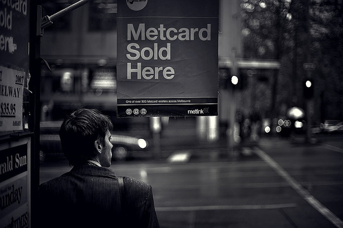
It is being used in big companies such as AT&T, Microsoft, Panasonic and NASA also use the typeface on the side of their space shuttles!
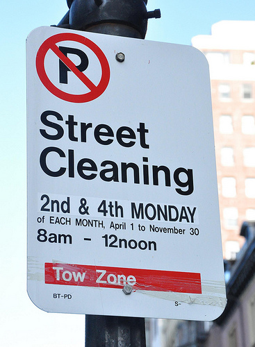
When you’re walking down the street next, stop and look around to see how many places are using Helvetica as a typeface for their company, or simply try and spot some Helvetica near you, I bet it won’t be long until you can see some!
So Why Is It So Popular?
There are many reasons why Helvetica could be classed as popular, because it is simple yet it still manages to keep the beauty and keeps design looking good, and it never seems to get old, after 51 years it is still as loved as ever.
Below I asked some fellow designers to tell me there reasons why they think Helvetica has been so popular and why they like using it in their design work:
Andrew Taylor (Additive Designs)
Twitter: http://www.twitter.com/Additive
Andrew explains why he thinks it is popular and the reasons he fell in love with the typeface:
It’s a good type face. It’s generic and fits well with everything, but at the same time has those beautiful little nuances that stand out; I’m specifically thinking of the lowercase a and the uppercase R.
My personal obsession with Helvetica started with seeing the movie; it was fantastic! I was already heavily drawn to typography so it was natural that I would fall in love with that movie and it’s type face. For awhile I used Heltetica exclusively, haha. I was already enamored with Josef Mueller-Brockman and David Carson; I was torn between the idea that everything had it’s place and that you can create something beautiful from anything (kind of like the Punk ideal of how even ugly can be beautiful). I used Helvetica for clean, modular layouts and then I have pieces on my wall from a very David Carson inspired piece set entirely in Helvetica.
I think designers love the flexibility of Helvetica. I’m well aware it isn’t the only type face like that and I actually haven’t used Helvetica in months; I’ve been hand lettering everything, but the neutraility of the type face makes it very appealing. The neutrality and the repition; I belive many people use it simply because it’s all around us so it must be a safe choice. It’s minimalist, it’s corporate, it’s cold, but at the same time it can be so powerful, emotional and moving when used just right.
Adelle Charles
Website: http://www.fuelyourcreativity.com
Twitter: http://www.twitter.com/adellecharles
Adelle simply put:
I think it’s popular in the design community because it’s been around for over 50 years & it meshes well into projects. There are so many typefaces out there that are so popular, but the signature of the designer is in all of the work.
She also left this quote by a famous designer:
“Helvetica leaves you with just the shapes. Other typefaces give you that but with other characteristics, whereas Helvetica is reduced down to just letters,” says Saville
Selene M. Bowlby
Website: http://www.idesignstudios.com/blog/
Twitter: http://www.twitter.com/idesignstudios
Selene went into detail about why she thinks it’s as popular as it is:
Helvetica is just one of those fonts - it’s clean, it’s simple, it’s versatile… It’s a font that can work well in many different applications.
With so many variations on the font, it can be used in many ways - each version capable of giving a completely different look and feel to a design.
I’m personally fond of clean / simple designs, often going for a “less is more” approach with many of my own creations. I especially like the thinner versions of Helvetica Neue, and use it on my own website, as well as on a few of my client web sites.
Although simple, Helvetica is still a stylish and highly readable font… simply put, it’s a classic that I don’t think will go away any time soon!
So there you some great responses as to why top designers today still think the font is popular within the design community even after 51 years!
In my opinion I think it is beautiful yet so simple and effective that it can bring any design to life and still give it the WOW factor that so many people crave when designing, and I can’t see it going anywhere just yet…
Here are some examples of Helvetica being used in everyday life and in design itself,
The Movie
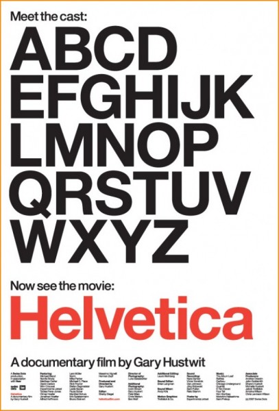
Yes thats right a movie about a typeface, sounds weird doesn’t it? But actually it is a great movie, where top designers explain where Helvetica fits into their design life, here is an explanation of the film from the website:
Helvetica is a feature-length independent film about typography, graphic design and global visual culture. It looks at the proliferation of one typeface (which recently celebrated its 50th birthday) as part of a larger conversation about the way type affects our lives. Helvetica is currently screening at film festivals, museums, design conferences, and cinemas worldwide
The film which was originally released last year (to celebrate Helveticas 50th Birthday) was a massive hit and being very popular within the design community, to read more about the film and to buy the DVD etc…visit the official Helvetica Film website HERE
Below is an example of some of the designers you can expect to see in the movie:
Erik Spiekermann, Matthew Carter, Massimo Vignelli, Wim Crouwel, Hermann Zapf, Neville Brody, Stefan Sagmeister, Michael Bierut, David Carson, Paula Scher, Jonathan Hoefler, Tobias Frere-Jones, Experimental Jetset, Michael C. Place, Norm, Alfred Hoffmann, Mike Parker, Bruno Steinert, Otmar Hoefer, Leslie Savan, Rick Poynor, and Lars Müller.
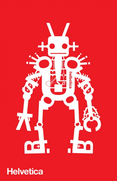
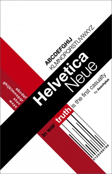
Some Helvetica Inspiration
So to finish off this post on Helvetica I will show you some Helvetica pieces to inspire you…Enjoy!
To Conclude
I think using Helvetica brings a piece of design to life just because it is so simple and yet it means so much to so many people! I know one thing is for sure, I LOVE IT!
What do you think?
Do You Love it or Hate it?
Leave a comment below and let me know what you think!
